How To Configure Hover Card Module For Beaver Builder?
Are you tired of spending countless hours searching for the module to display an image and its description in an artistic way? Well, search no more! We are Introducing the Hover Card Module for beaver builder, your ultimate solution for creating captivating and interactive content. Whether you’re a web designer or developer, this revolutionary module will take your websites to new heights.
Say goodbye to dull or static content, and install our FREE hover card module for beaver builder to captivate your visitors with stunning hover effects, seamless transitions, and engaging information cards.
In this guide, you’ll learn how to use hover card module on your wordpress website and use variations of the hover card module with prebuilt layouts and customize styling options according to your website needs.
So, are you ready to unleash your creativity and elevate your web design?
Let’s get started!
Requirements
First, You need to install and activate the free version by Xpro Beaver Builder to use this amazing module. If you already have the plugin installed, just ensure the Hover Card Module is ‘Enabled’, so you can find it in the Beaver Builder editor.
Steps To Enable Hover Card Module From Xpro Addons Dashboard
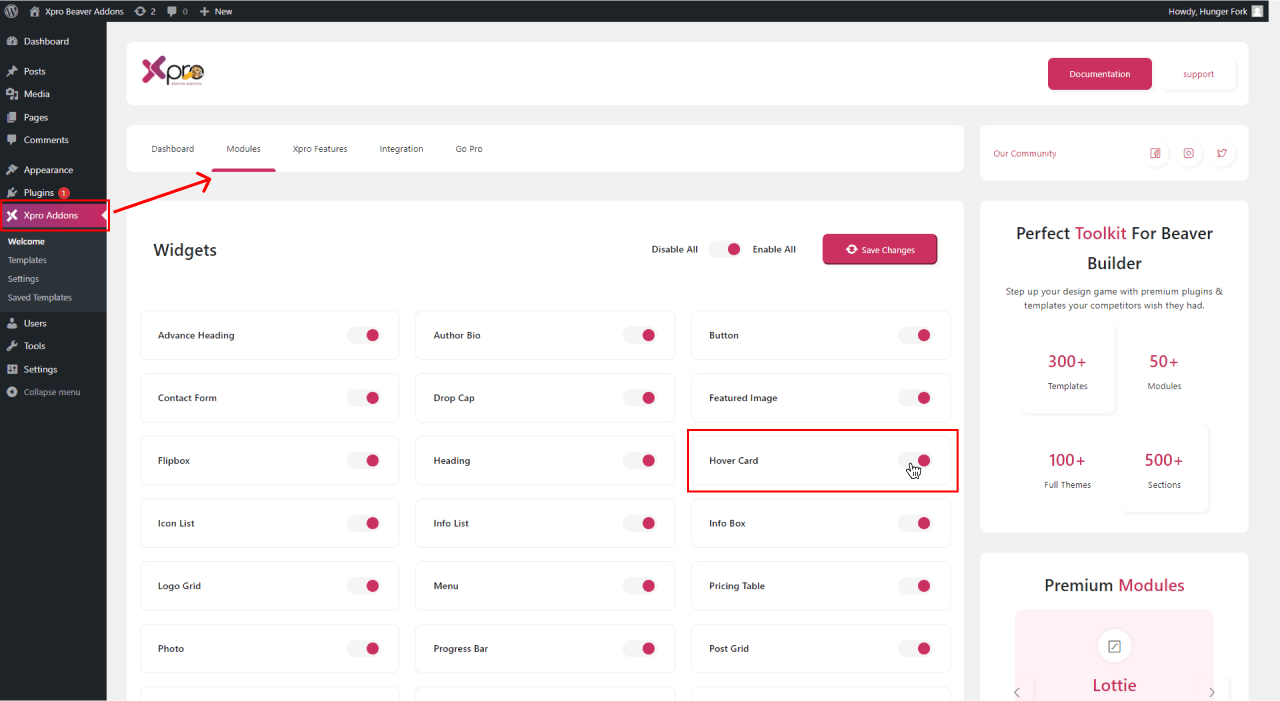
Step 1: Click on the Xpro Addons option available on the WordPress Dashboard Menu.

Step 2: From the Xpro Addons Dashboard, click on the Modules Tab, find the Hover Card Module, and then, toggle the button ON to enable it.
Steps To Use Hover Card Module In WordPress For Beaver Builder
If you own a business that sells technical products or provides services, hover card module can assist you in both displaying and adding descriptions of your products or services. You can add your service information by adding an explanation in the hover effect.
By activating hover card module for beaver builder, you can showcase your products, ideas, portfolio, team, events, and posts without cluttering the main interface. It allows you to access specific settings, edit content, or preview changes without navigating to a separate screen.
Let’s start further about how you can use this powerful module.
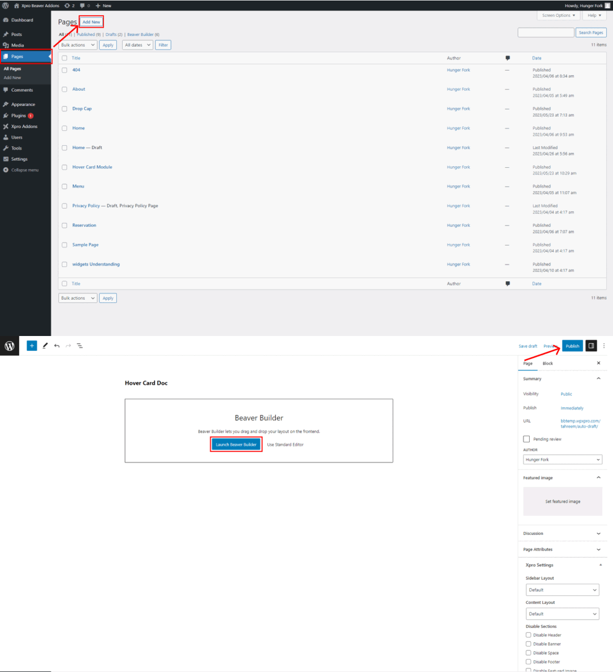
Step 1: Add New Page
To add a hover card, go to the website page where you want to use the Hover Card module and open it in the Beaver Builder editor. If you’re creating a new page, click on the “Add New Page” button and select “Launch Beaver Builder”.
Step 2: Drag and Drop Hover Card Module In Row or Column
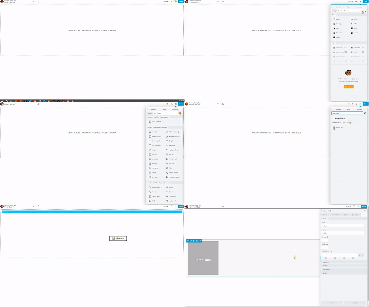
- On the Beaver Builder editor page, click on the “+” icon and see the side menu.
- Click on Xpro Addons section, available on beaver builder Editor side menu.
- In the module search bar, type “Hover Card” and select the Hover Card module.
- Then, Drag hover card module and drop it on the desired editorial page.
Here is the default look of the Xpro hover card module.
Step 3: General Setting
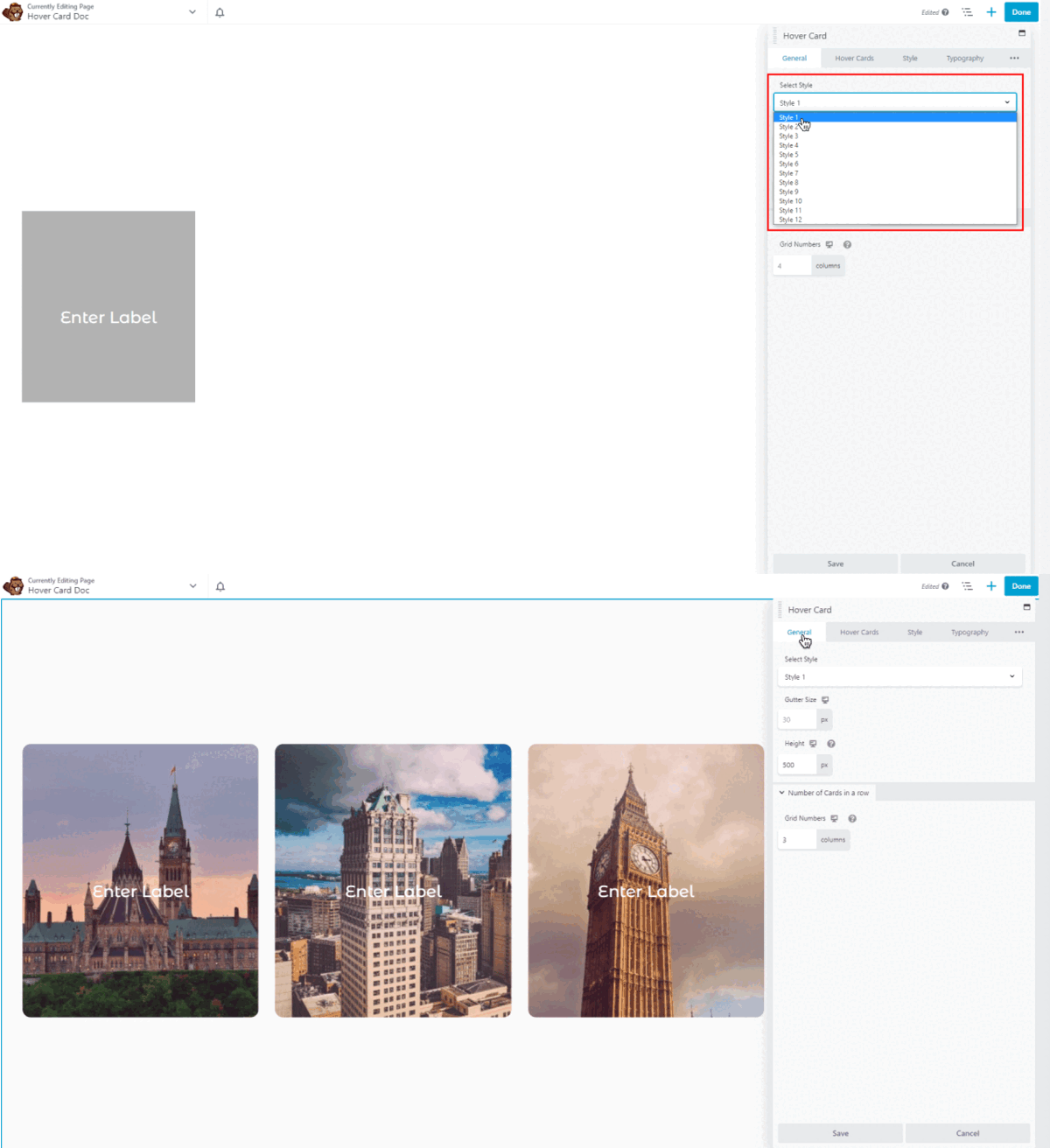
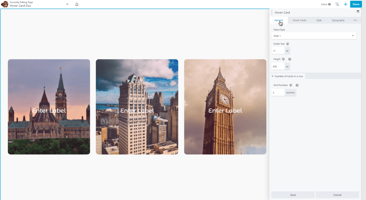
- Bonus Point? Hover Card for beaver builder comes with 12 different layout variations to choose from. Choose any style from the layout drop-down menu.
- After selecting the layout, you can define the default layout for your website, including the width, and height. You can also choose the number of cards in a row.
Step 4: Setting Up The Hover Card Module
- From the hover card section, you can add multiple hover cards and can edit each card differently to create a unique style and attractive look for your website.
- If you have a list of hover cards, you can easily change the order or position, duplicate them to reuse the same content or layout but with slight modification and you can also remove or eliminate a hover card module entirely.
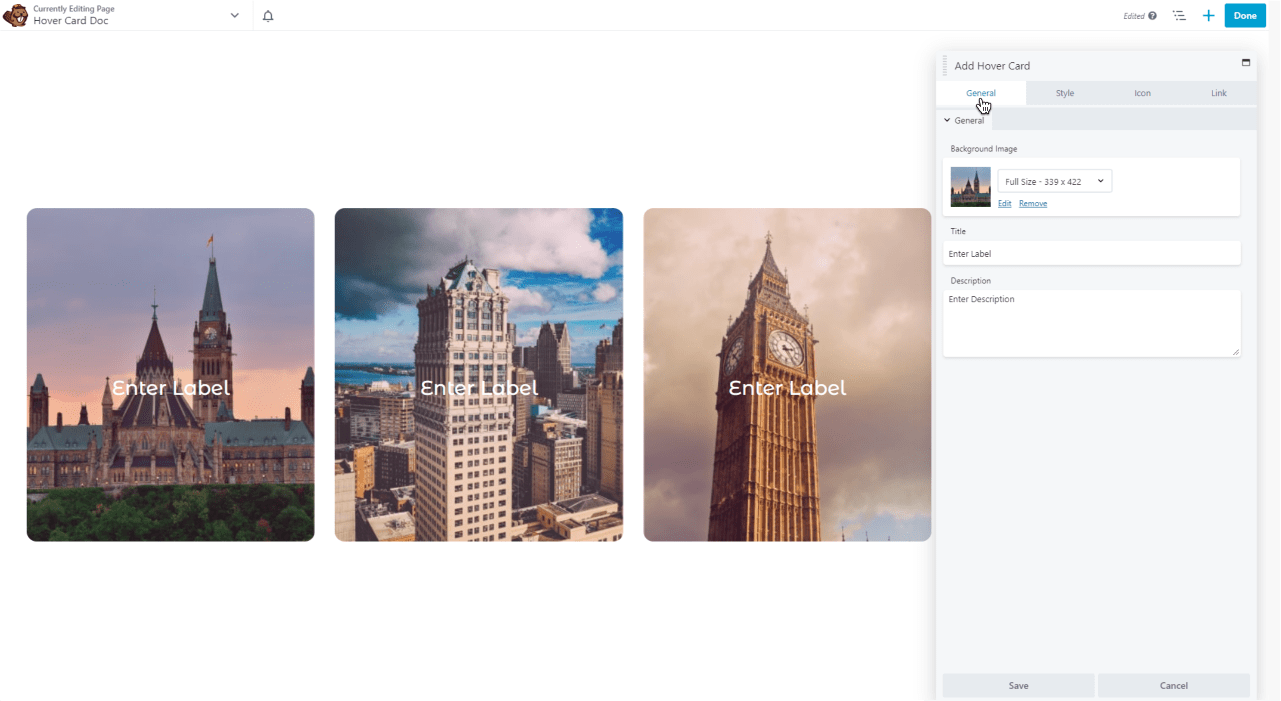
Edit Hover Card
By clicking on the edit hover card, you can easily adjust each hover card separately.
General Setting
You can add a background image, title, and description on each card. Adding a background image, title, and description on hover card enhances its visual appeal and provides relevant information to the user in a concise manner.
Style Setting
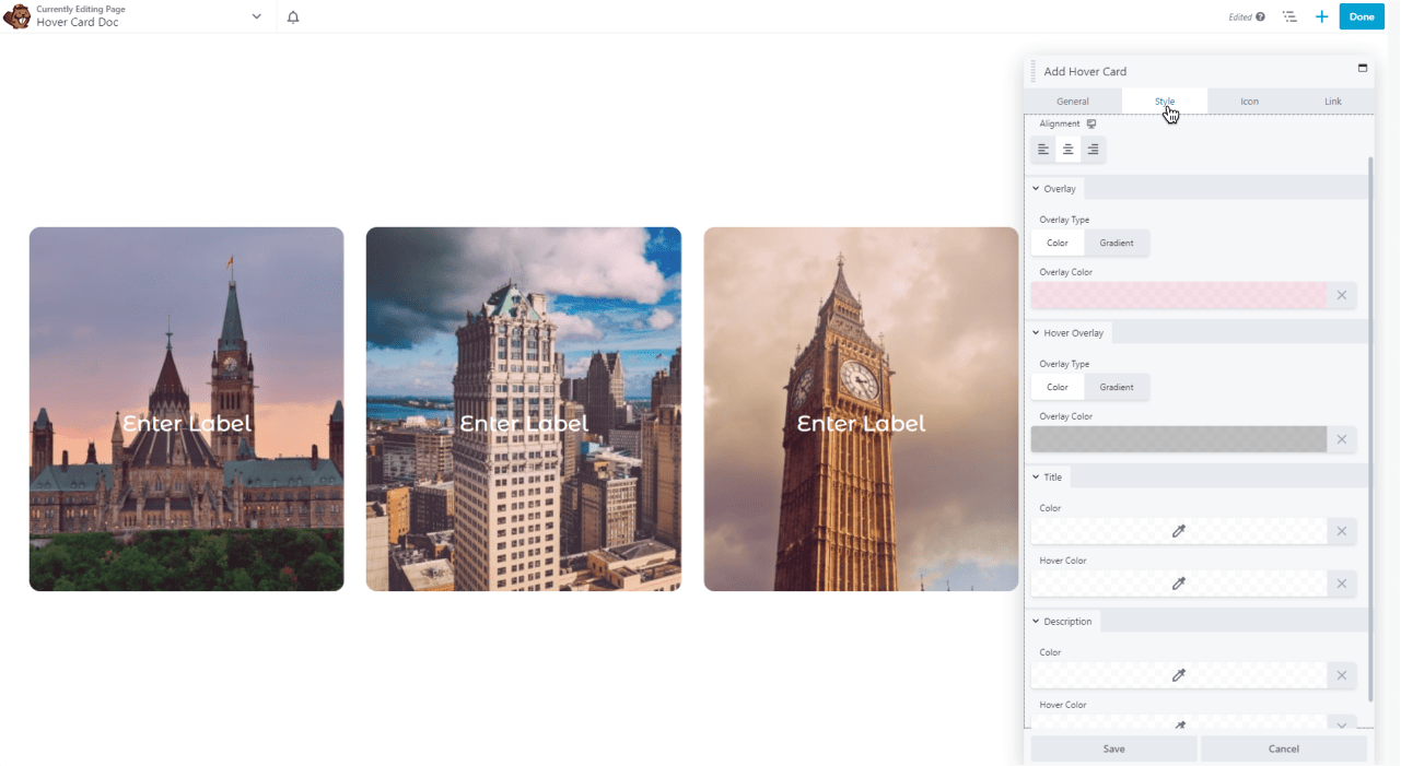
You can style your hover cards according to your website design.
- Alignment: You can align each hover card separately.
- Overlay: You can add an overlay color or gradient to provide a visual cue that the hover card is interactive and can be activated by the user.
- Hover Overlay: You can apply different hover overlay colors or gradients. It can be used to display a preview or snippet of the content within the card and can be useful when dealing with longer texts, images, or multimedia content.
- Title & Description: You can style your title and description by applying different colors or hover colors
Icon Setting
You can add icons to provide visual cues that quickly convey the nature of the content or functionality within the hover card. Users can easily recognize and associate the icon with a specific action, category, or information type.
- Icon Basic: In this section, you have full control to show the icons or not on your hover card. If you want to show, you can select the icons from the icon library.
- Icon Styles: You can change the icon color, size, and hover color.
- Margins: You can set the margin of your icon from the top or bottom where you want.

Link Setting
You can add a link on each hover card because it can provide additional context to access more detailed information about a particular item or topic that display on hover card.
- Call to Action: You can add an icon or button on hover card for CTA.
- Link: You can add links to the text.
- Colors and structure: By adding a link or CTA, You can easily change the color or structure as per your preference. You can also add background color, border color or apply border style, and apply shadow or radius.

Step 5: Style Setting
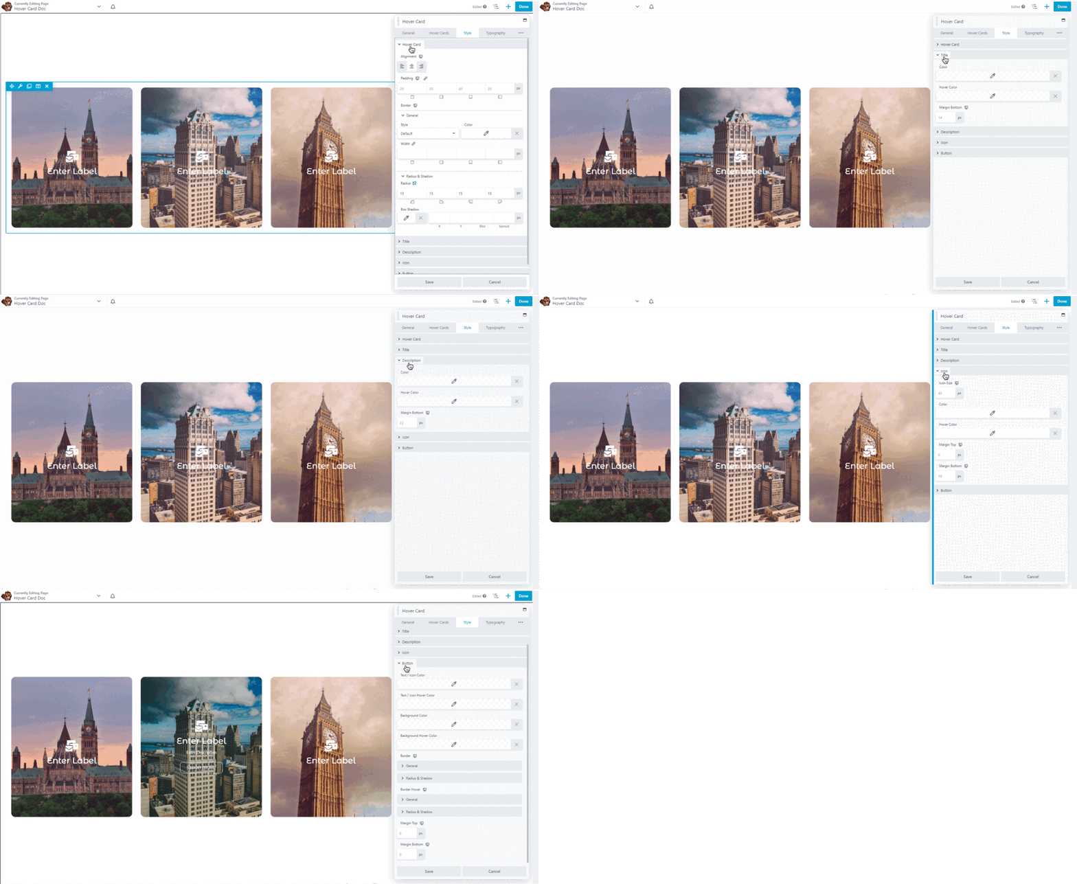
From the style setting, you can style all your hover cards together to create a cohesive look for your website.
- Hover cards: You can align your hover cards, apply padding, add border color, apply border style, adjust the border size, and apply shadow or radius.
- Title: You can change the title color, hover color, and margin Bottom on all hover cards together.
- Description: From here you can add description colors or hover colors on all hover cards’ descriptions
- Icon: You can Adjust the icon color, size, hover color, and margin on all hover cards equally.
- Button: You can also style your CTA button according to your website design.
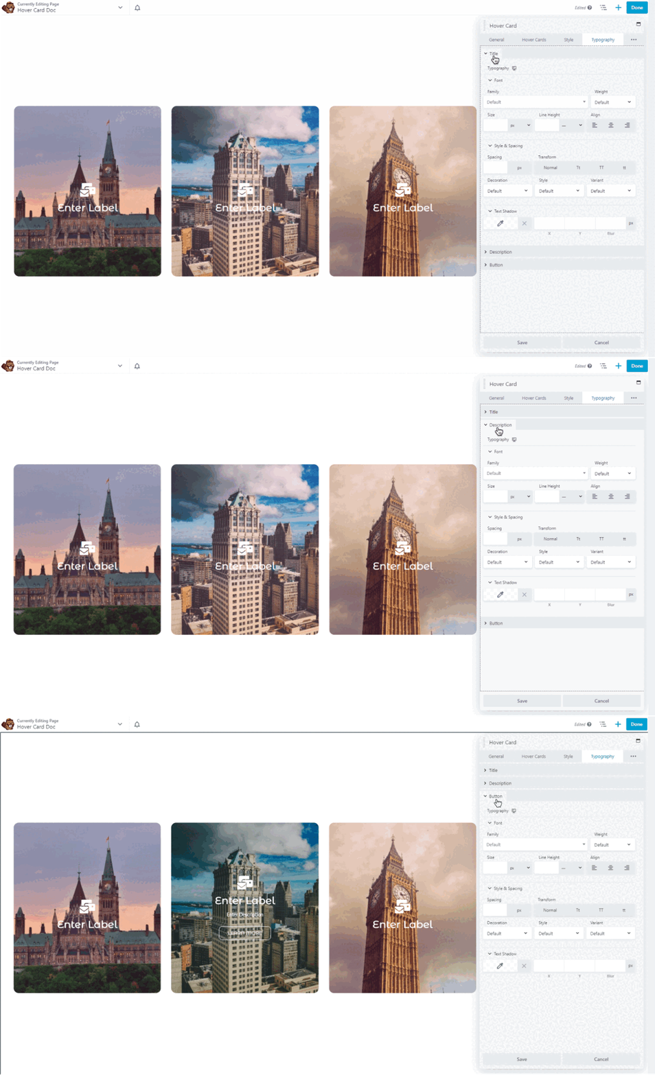
Step 6: Typography Setting
Typography setting lets you set the default font family, size, line height, and letter spacing on your hover cards. You can customize the typography to match your brand’s style and ensure readability.
- Title: In this Section, you can perform multiple customizations and make your title look suitable according to your website theme. You can change your title font, adjust the size, style your title on all hover cards, and much more. You can also add a text shadow to enhance the appearance of the title.
- Description: In this section, you can edit the content for the description. Change the font from typography, adjust the size, and style the content.
- Button: In this section, button section offers a huge range of customization options. Other than simply editing the font and color of the text, you can add a hover effect. Utilize these amazing features which engage the users with your offerings. You can also put a background and edit it to enhance the appearance.
Best Hover Card Module For Beaver Builder:
This is all from our Xpro Hover Card for Beaver Builder. We hope that you fully understand and will be able to utilize this amazing module. We have Highlighted all the important content with custom images, buttons, icons, hover effects, and more.
If you want to explore more and add more attractive features on your website then check our other 90+ modules for beaver builder. Moreover, you can check out our other promising modules like the heading module, content toggle, animated heading module, Icon Box, and more.
So let’s practice our Xpro Hover card module and do ourselves favor after using them.
If you have any questions in relation to the WordPress hover card module for beaver builder, feel free to submit your query in the comments below.
