How to use Team Carousel Module for Beaver Builder?
Do you want to showcase your team members in a styling way? If yes, then you should use Xpro Team Carousel module for beaver builder to make team section that can instantly grab attention of your visitors.
By using the team carousel module for beaver builder, you can showcase your team members in an interactive way. You can create a visual appeal and use the space of your website efficiently. By doing this, you can instantly enhance the aesthetics of your website and increase user engagement.
Xpro addons for beaver builder offer the best module to create team carousel. It is fully customizable and easy to use.
This guide will teach you how you can use the team carousel module in your beaver builder website. Let’s get started!
Requirements:
To use the team carousel module for beaver builder, you need to install and activate the Xpro addons for beaver builder- lite.
Before using the team carousel module you should enable it from the Xpro module section.
(Xpro addons plugin-> modules-> team carousel-> enable).
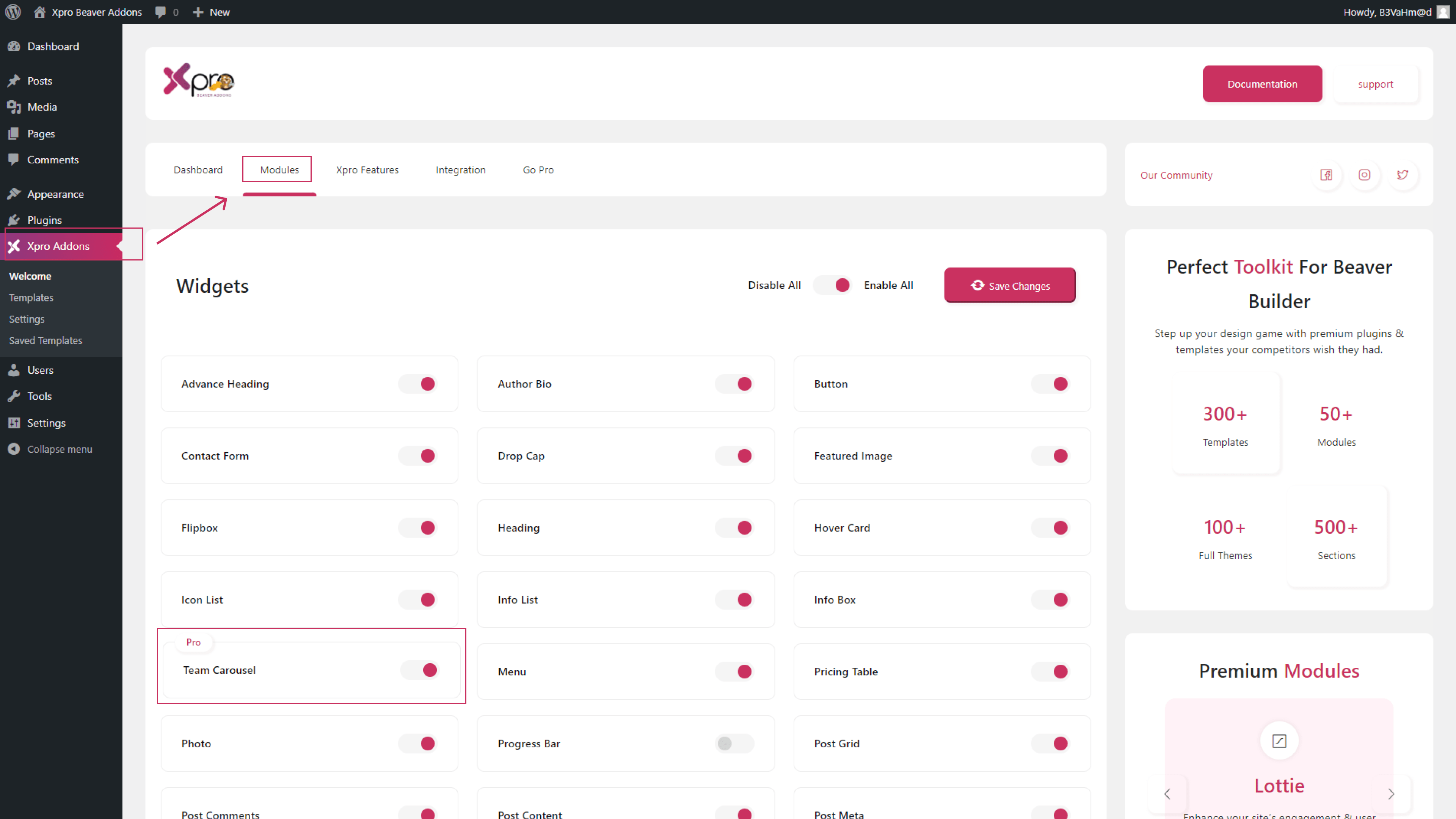
Steps to Configure the Team Carousel Module for Beaver Builder:
To configure the team carousel module for beaver builder, follow the steps given below:
Step 1: Add new page
First go to the WordPress dashboard to create the team carousel. Click on the “pages” from the menu on the left side. Now click to “Add new” at the top.

Step 2: Drag-n-drop the Xpro Team Carousel Module
Now go to the beaver builder editor page. Click on the “+” icon on the top right corner. This will open a side menu. Here you will search for the Xpro team carousel module. Drag and drop the module on the editorial page
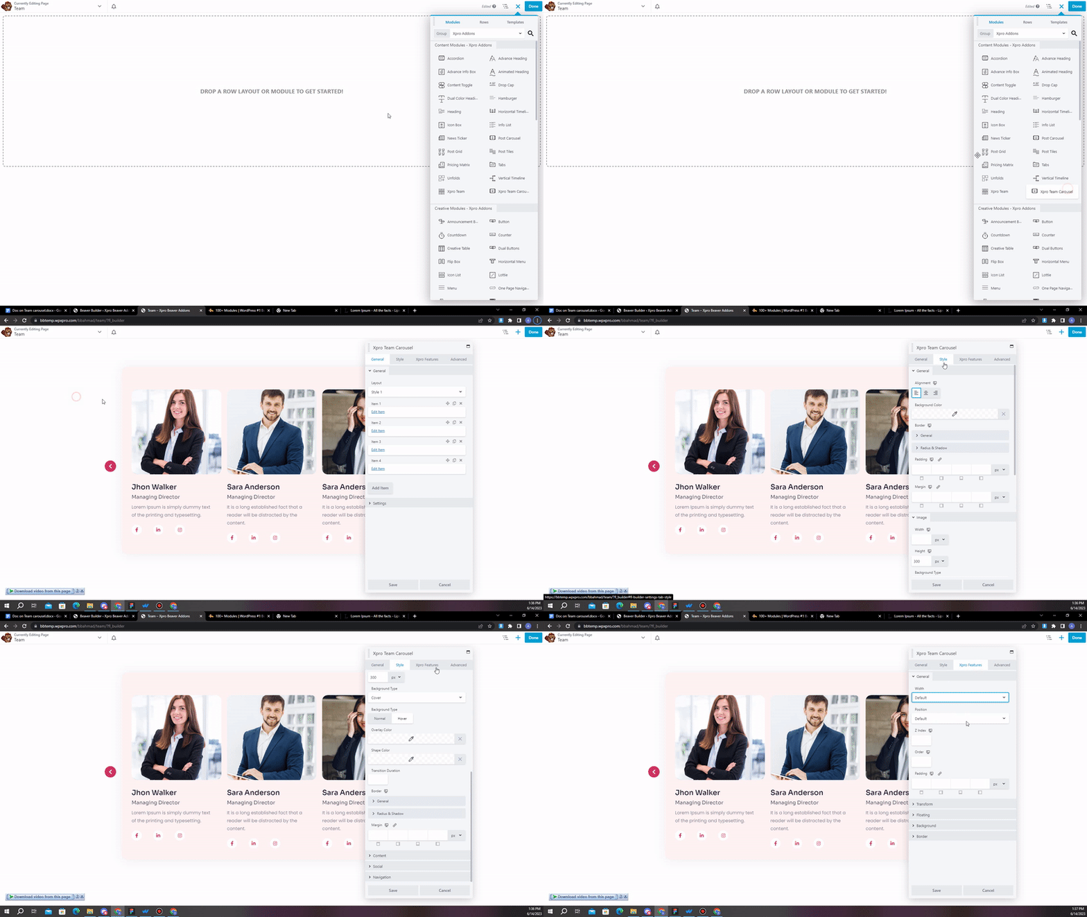
Step 3: General Settings
In this section, you can choose layout you want from 15 different layout options. Then you can add items and add details one by one. You can add:
- Image
- Title
- Link
- Designation
- Description
- Social links
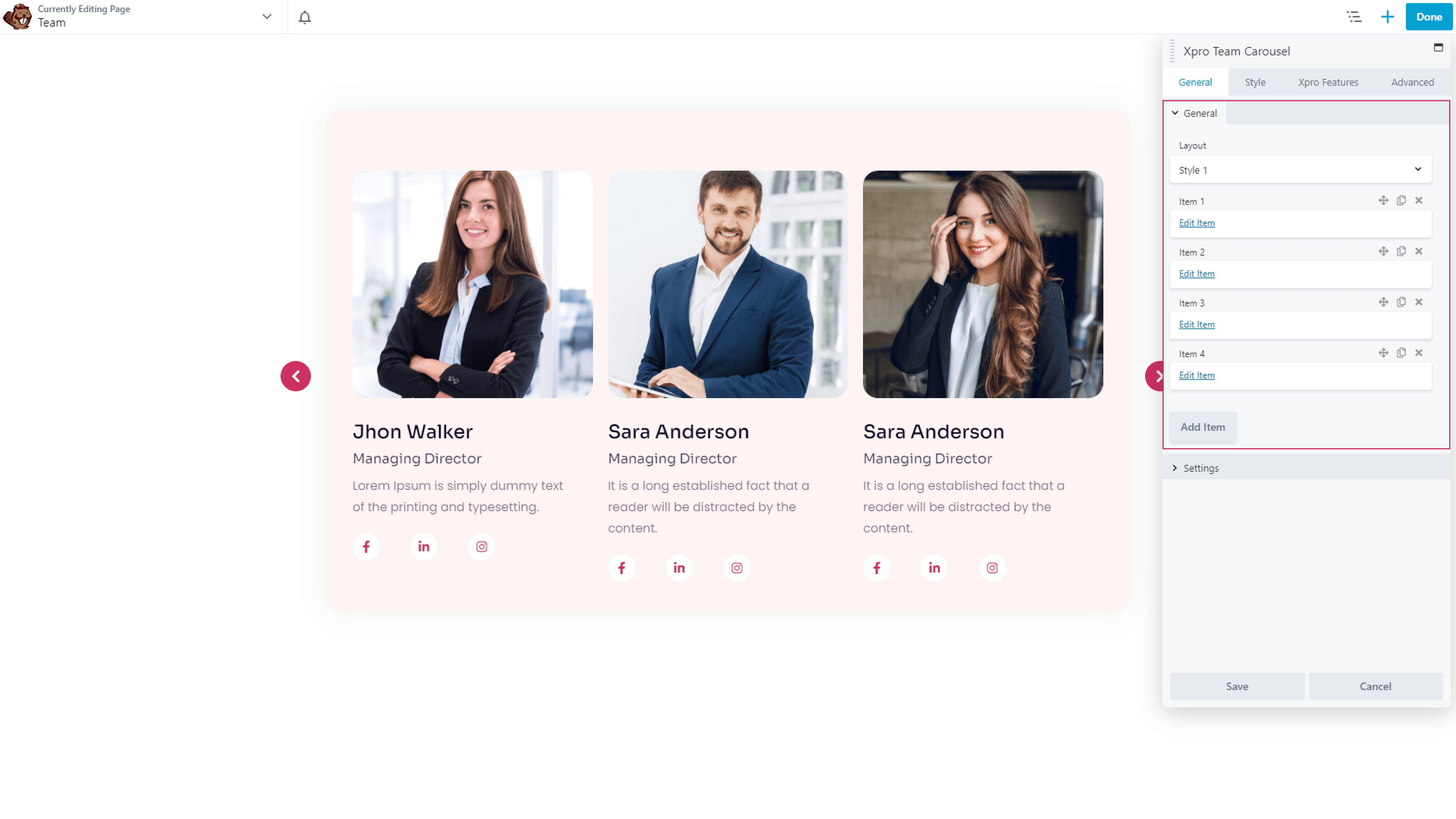
Settings:
In this section, you can:
- Choose number of items you want to show
- Set margin
- Enable loop
- Enable mouse drag
- Enable autoplay
- Enable navigation
- Enable dots
Step 4: Styling
In this section, you can style your items. There are six parts in this section:
General styling:
In this part, you can do general styling of your team carousel. Add background color, border and much more.
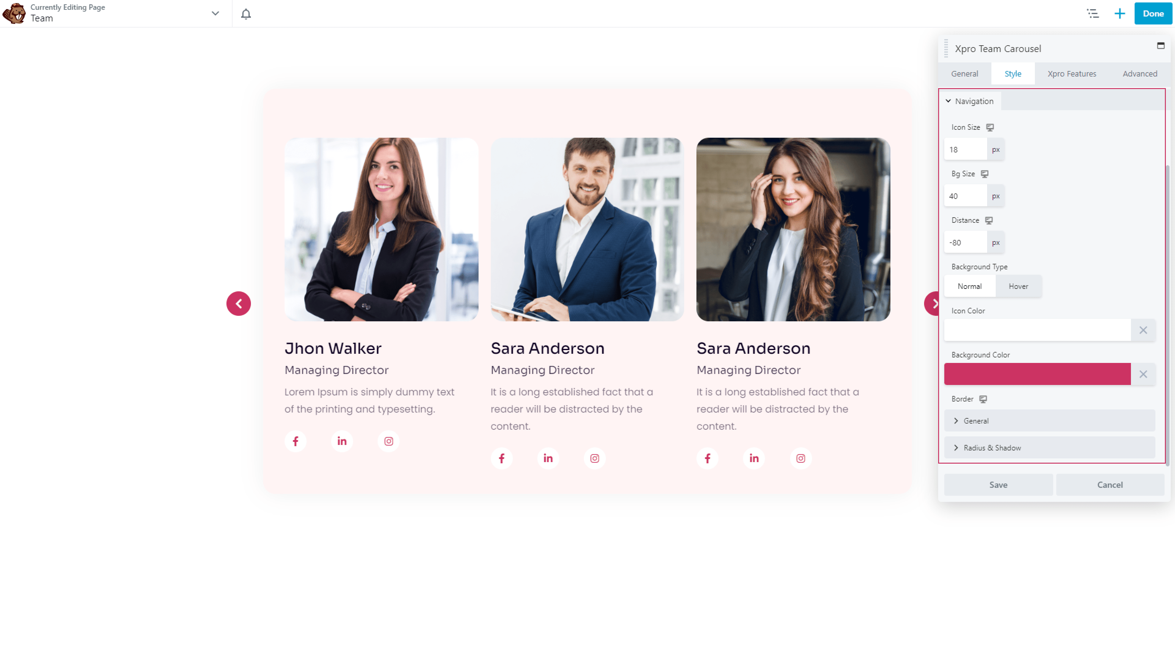
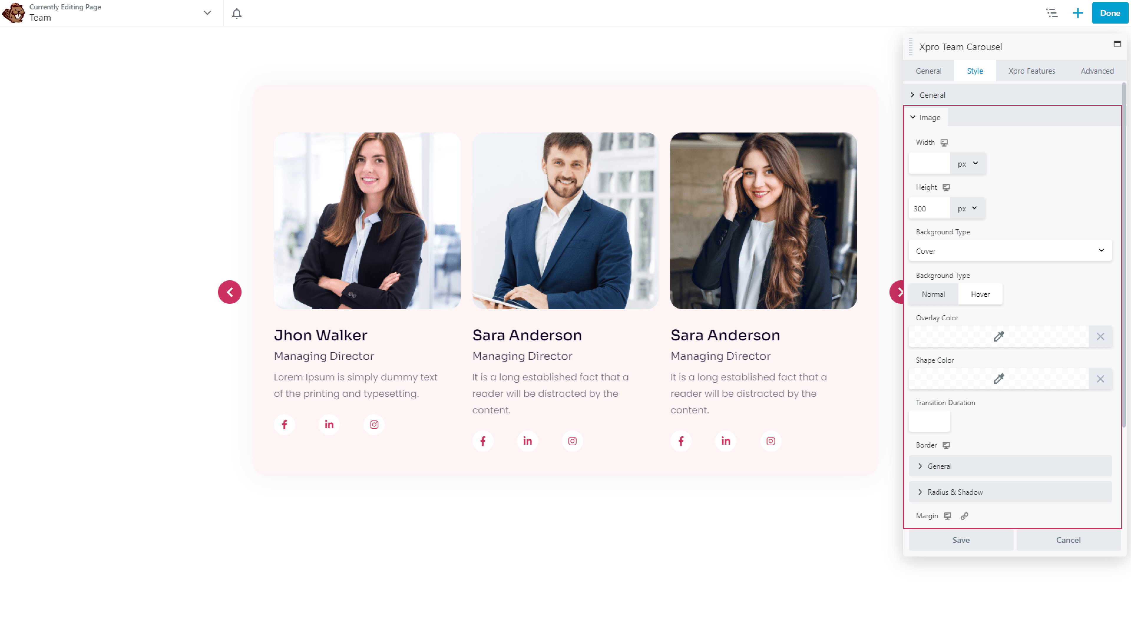
Image:
Style the image now. Choose width, height, background type, color, border and more.
Content:
Now style the content part in the same way. You can style title, designation and description of your team members.
Social icons:
Now choose the color and size for your icons.

Navigation and dots:
In this part, you can style the navigation dots in your team carousel.

Conclusion:
You can show your team members in a creative way by using the team carousel module for beaver builder. With the help of this module, you can not only create a visual appeal in your website, but you can also optimize the space of your website. By doing this, you can instantly enhance the aesthetics of your website and increase user engagement. To learn more on team carousel module, you can also check our blog on best ways to use team carousel module for beaver builder. It is very easy to use. So try our accordion heading module now!
If you like to explore more features to customize your headings, you might check our drop cap module, dual color heading module and accordion module for beaver builder.
Check our free modules for beaver builder to bring more creativity in your website. You can also explore our 50+ pro modules for beaver builder that will take your website to the next level.
Feel free to ask questions in the comment section below, if you have any other question related to dual accordion module for beaver builder.
