How to Add Drop Cap Module in Beaver Builder
User experience is a critical aspect when it comes to designing a website on WordPress. With so many pieces of information, it can be hard to make a page that is both easy to read and visually appealing. This is where drop cap module for beaver builder can be an excellent addition to your web design.
A drop cap is a design element that involves using a larger initial letter at the beginning of a paragraph. This letter is usually set in a different font or color and may extend down two or more lines of text. Drop caps are an effective way to make your text more visually interesting and draw your readers’ attention to the beginning of a paragraph.
Let’s look at how I create a drop cap through Xpro beaver builder addons.
Requirements:
To utilize the drop cap module for beaver builder, first Install and activate the Xpro addons for beaver builder. If you already have the plugin installed, just make sure the drop-cap Module is ‘Enabled’, so you can find it in the Beaver Builder page editor.
How to Enable Drop Cap module in Beaver Builder?
To enable the content toggle module in beaver builder, follow these steps:
Step 1
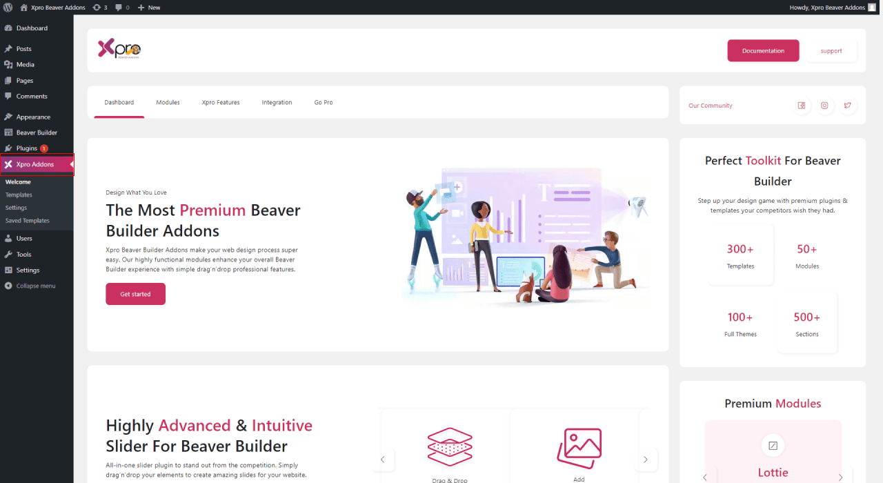
Click on the Xpro Addons option available on the WordPress Dashboard Menu.
Step 2
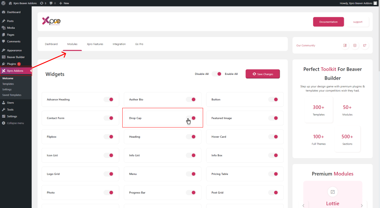
From the Xpro Addons Dashboard, click on the Module tab, find the drop cap module, and finally, toggle the button to enable it.
Step 3:
After enabling it, click on the save changes.
Steps to Use Drop Cap Module for Beaver Builder
A drop cap module by the Xpro Addons for beaver builder WordPress allows the user to style your paragraphs to increase reader interaction. This module is capable to drag user attention to your website. Add a drop letter at the start of the content to give an impact on readers.
Xpro Drop Cap Module is fully responsive on all devices which makes it easier for your website user engagement with your content. Let me show you how you can fully utilize this module to get full customization control.
Step 1: Drag and Drop the Drop Cap Module for Beaver Builder
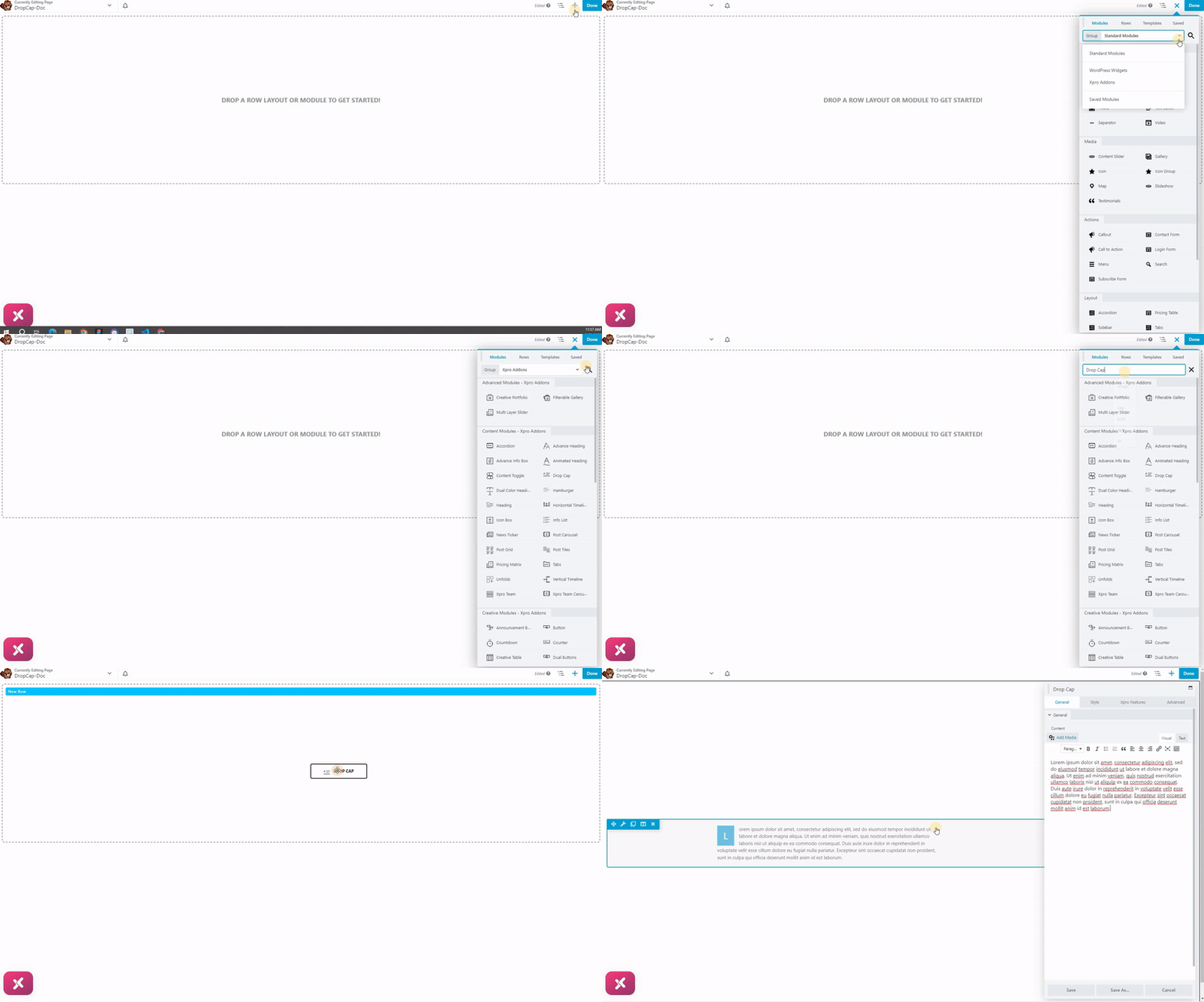
- Click on the Xpro Addons and select the drop cap module.
- Find the module by scrolling down in the Xpro addons section. Drag and drop the Xpro drop cap module on your desired area.
- The default look of the Xpro drop cap module for the beaver builder.
Step 2: Customize Drop Cap Content
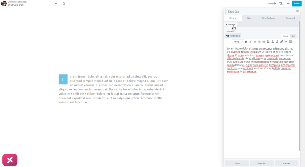
Add content to the drop cap module in the general tab. The first letter of your content will automatically highlight itself as a drop cap. You can change your website text with your own choice. In addition, you can add an image as a drop cap for your text paragraph. Our module gives the capability to add media to your content to enhance the visual hierarchy of the content.
In the given below you can see the media option to add an image in your drop cap module.
Step 3: Styling Drop cap Module
Every content should have the ability to engage users more to read. A good drop cap style can make your boring content into something unique. An attractive font style, bold, adequate space, padding, margins, color, and much more to entice your audience. In this module, you can customize the thousands of font family styles to make your content unique and aesthetic.
Font Style
Xpro Drop Cap module comes with a wide range of font styling features. You can select 1000 font styles to give the impact of your choice. You can customize the font color from the palate to enhance the readability of the text on your website. The text type helps the reader in comprehending information from the content. To attract your audience font color, font size, and font type are important elements.
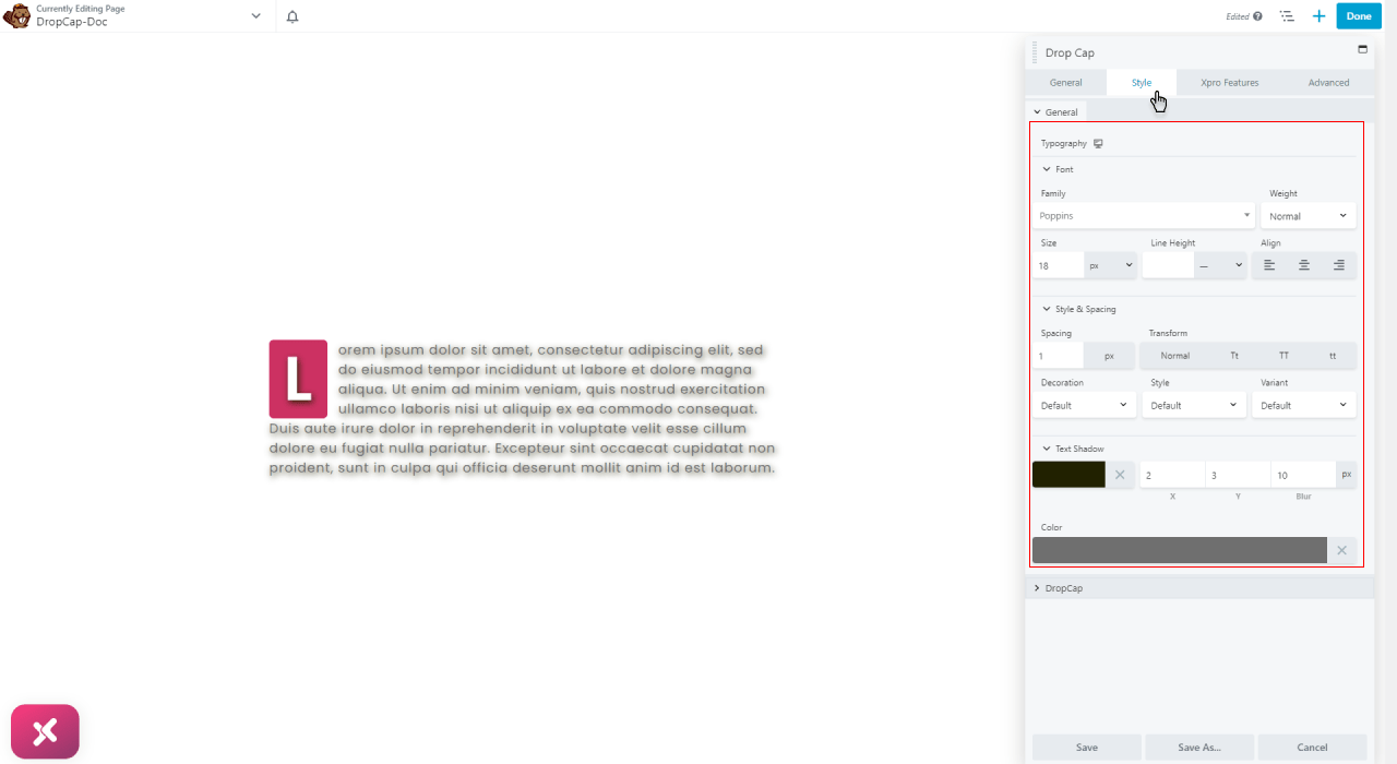
Step 4: Adding Custom Typography to Drop Cap
Set amazing typography for the aesthetic appeal of the content. Select the best typography for your drop cap module to make it more visible to your audience.
- After that select the most vibrant color for your drop cap.
- Add a solid color background or play a little bit with your design skill to apply the best combination of shadow text as the background for your drop cap letter.
- You can also add any of the 5 default options of borders to your drop cap.
- In the end, you can adjust the border, radius padding, and margin to align the drop cap widget best with the design of your site.
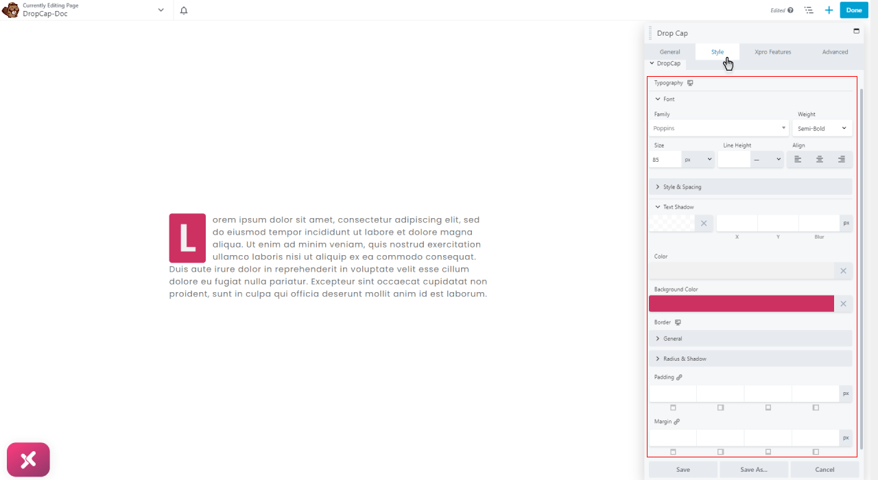
Step 5: Save Change and Publish
After you have done customizing and styling the info list module for beaver builder. Save all the changes that you have made and publish them to your beaver builder website.
Best Drop Cap Module in Beaver Builder
That’s all we have to say about our drop cap module for beaver builder at the moment. Hopefully, after reading this post, you have a better understanding of how you can add the most interactive and engaging drop cap features to your website by utilizing our easy-to-use drop cap module by Xpro. As a result of this module, you will be able to showcase your content in a comprehending way that is very helpful for the reader.
Check out our complete list of free beaver builder modules and download them for free. If you’re looking for a great way to explore and get more attractive beaver builder plugins to your website then try these Xpro modules today!
you can check out our latest blog on drop cap module.
