The Xpro Icon Box Module for Beaver Builder is a powerful tool for presenting important website or promotional information in a delightful and visually appealing way. Utilizing this module, you can create an interactive feature box for your WordPress website which consists of an icon, title, description, and CTA.
The Beaver Builder Icon Box can be used to highlight the characteristics of your product, service, or event in an eye-catching manner. This stunning Beaver Module allows you to add interactive hover effects and icon animation can elevate your website design and user experience.
How to Install Icon Box Module for Beaver Builder
In order to use the Icon Box module, install and activate the FREE version of Xpro Beaver Builder Addons. If you already have the plugin installed, make sure the Icon Box is enabled from the Xpro Addon dashboard, so that you can find and use it in the Beaver Builder Editor.
To enable the Module, simply follow these steps.
Step 1
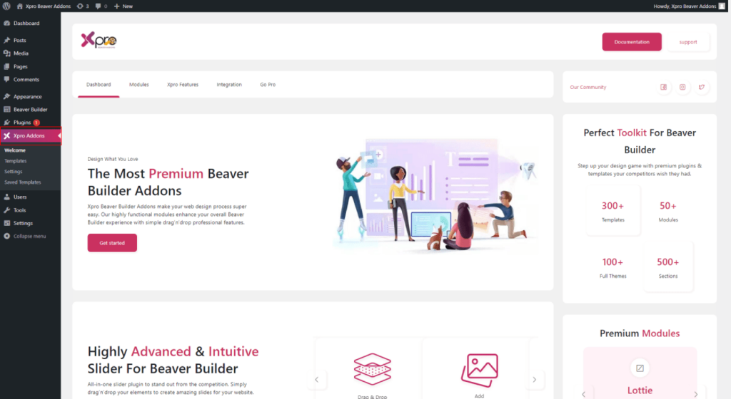
Click on the Xpro Addon section in your WordPress dashboard.
Step 2
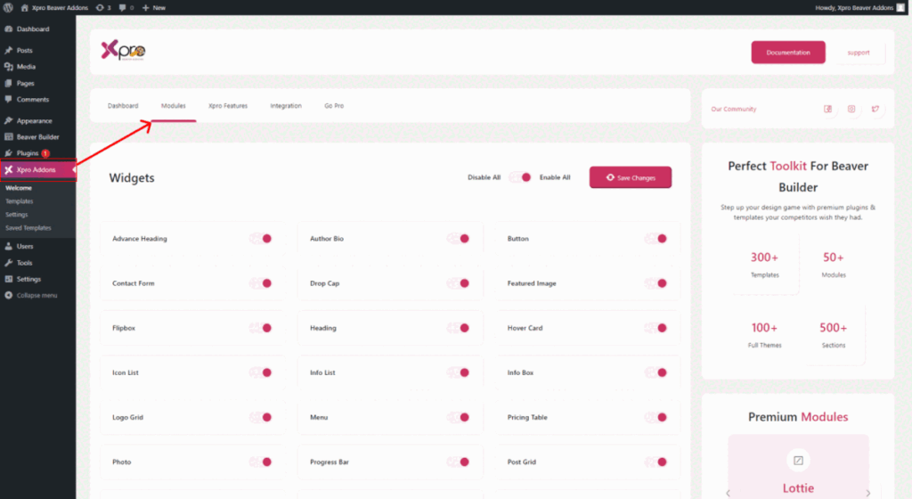
From the Xpro Addon dashboard, click the Module Tab, Locate, and toggle on the Icon Box.
How to Use Beaver Builder Icon Box Module
The Beaver Builder Icon Box widget consists of all essential elements such as icons or SVG, text, and links with stunning interactive features to help you create the best content outcome. You can use this tool to create feature boxes on your WordPress website. All the elements can be customized according to your requirement.
This powerful module has a user-friendly application that allows developers to create content highly engaging content boxes with stunning features in no time. Let’s discover step-by-step instructions to use the Xpro Beaver Builder Icon Box module.
Step 1
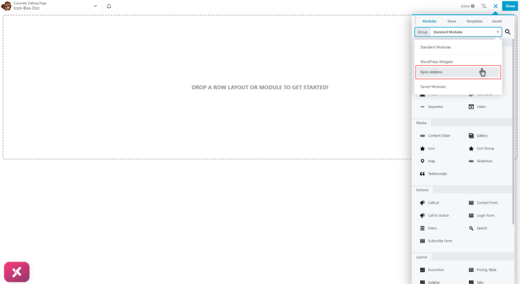
Open the Beaver Builder Page Builder and search or locate Icon Box in the Xpro Addons group from the Beaver Builder edit section.
Step 2
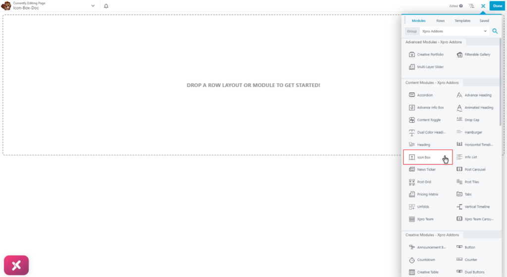
Select the icon box widget and drag’n’drop it to the desired page location.
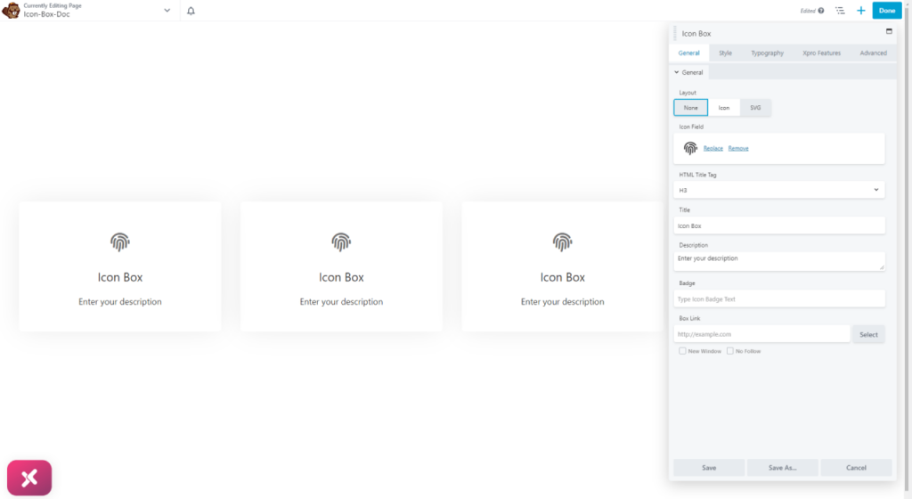
The Icon Box Beaver Beaver Module will look like this after you drop it into the Page Builder.
How to Add Content in the Icon Box Module
The widget is divided into three major content elements. The icon, title, and description are respectively structured in a box.
Starting from the icon, you have the option to either select a relatable icon from the library or upload an SVG in the box display.
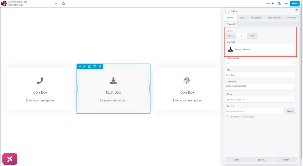
Add a title in the widget display and assign it an appropriate heading tag.

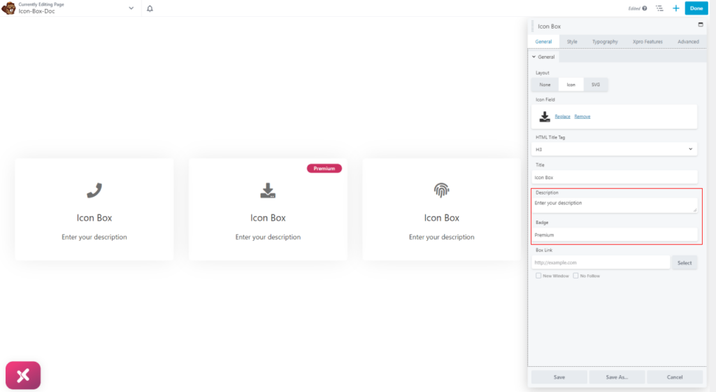
Write a description by simply typing content in the Description field. Furthermore, you can create a badge for the box.
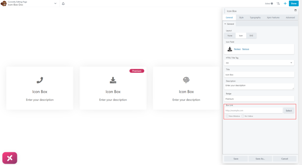
Provide a link to your Icon Box so that the user is directed to a detail page after clicking anywhere on the box. Moreover, choose to open the link on the same or a new window.
How to Style Beaver Builder Icon Box Module
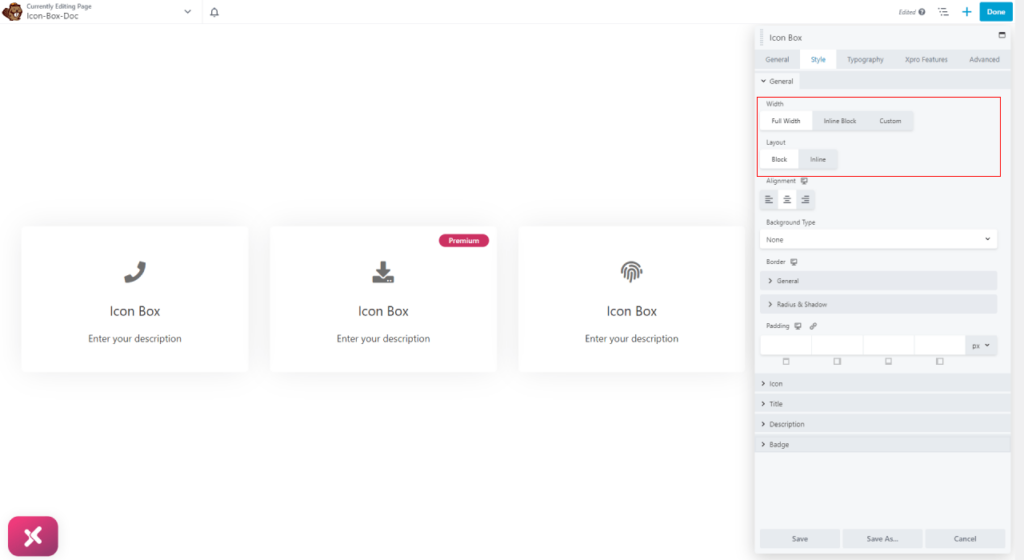
To create a design that meets your specific preferences, we offer customization options for all the elements within the box. Starting with the styling process, you can begin by adjusting the width of the box. We offer three options for customizing the width, including full width, inline block, and custom. Further, select the layout between block or inline.
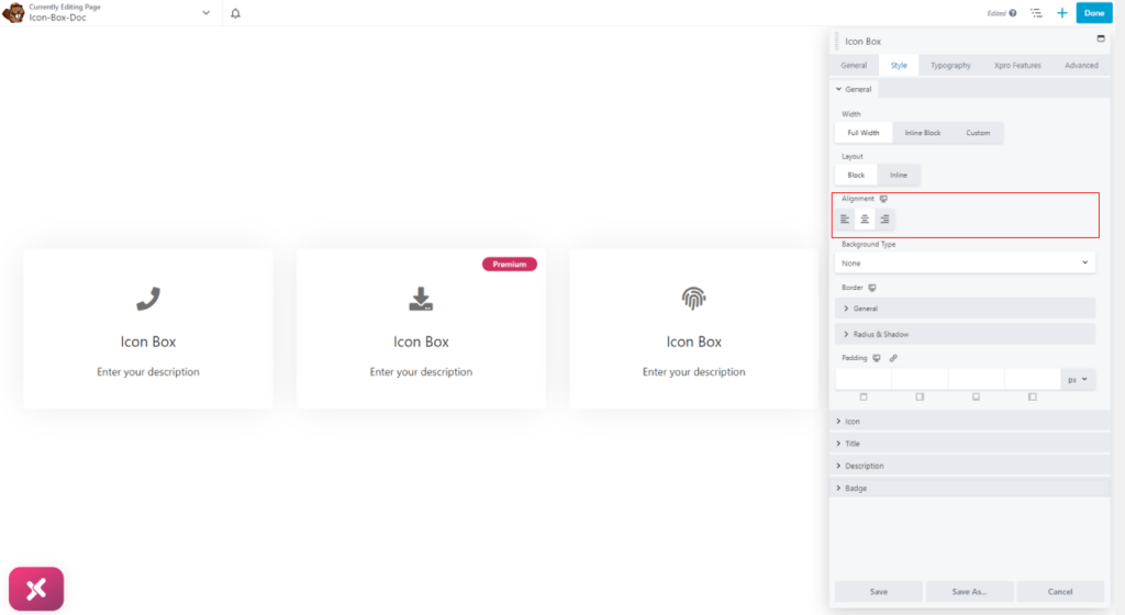
The content in the icon box can be positioned to the left, right, or center of the box.
We offer a variety of background customization to enhance the visual appeal of the icon content box. You can personalize the background by adding colors, gradient colors, and images. Furthermore, you have the option to create a different background for the box’s normal appearance and when a user hovers the mouse over it.

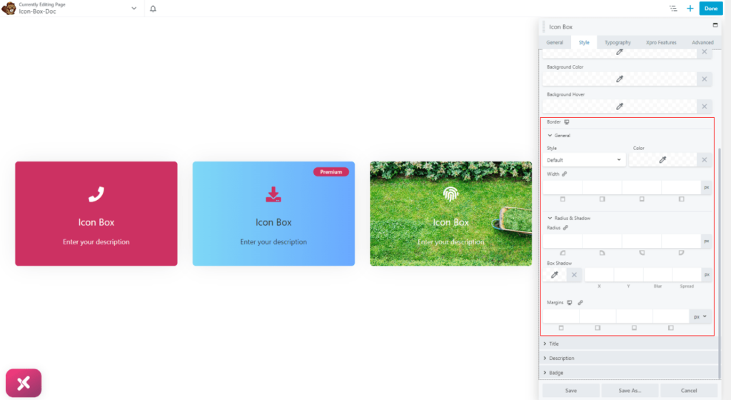
You can create a border around the box by selecting a border type between solid, double, dotted, and dashed. Moreover, you can customize the border width, radius, and color. For more visual attraction, add a shadow effect from the shadow box. Adjust the shadow position from its axis and manage its blur and spread display.

How to Style Icon in Icon Box
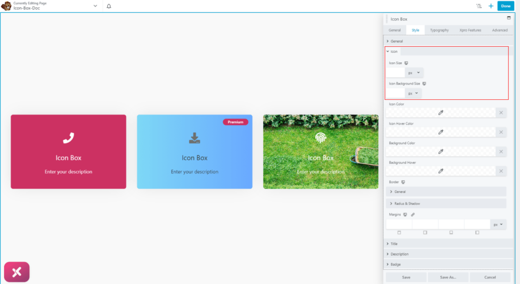
For further module customization, access the icon menu by simply clicking on it. From there, you can adjust the size of the icon and its background to best meet your requirement.
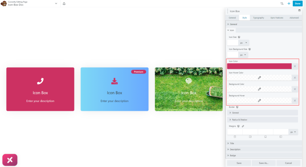
Moreover, you can color the icon and its background for normal and hover states.
To produce a more personalized design, you can add a border to the icon and change its width, radius, and color. You can also add a shadow effect to further enhance the icon’s visual appeal.
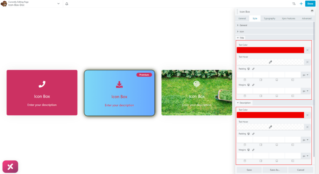
Add colors to the title and description for their normal and hover effect. Furthermore, adjust their padding and margin.
How to Style Badge
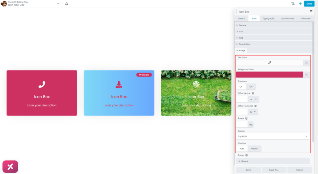
Under the badge menu, you have access to perform design customizations to the box badge. Here you have the option to change text and background color. Furthermore, you can transform the position of the badge through its vertical and horizontal offset. Moreover, you can rotate the badge display to any angle.
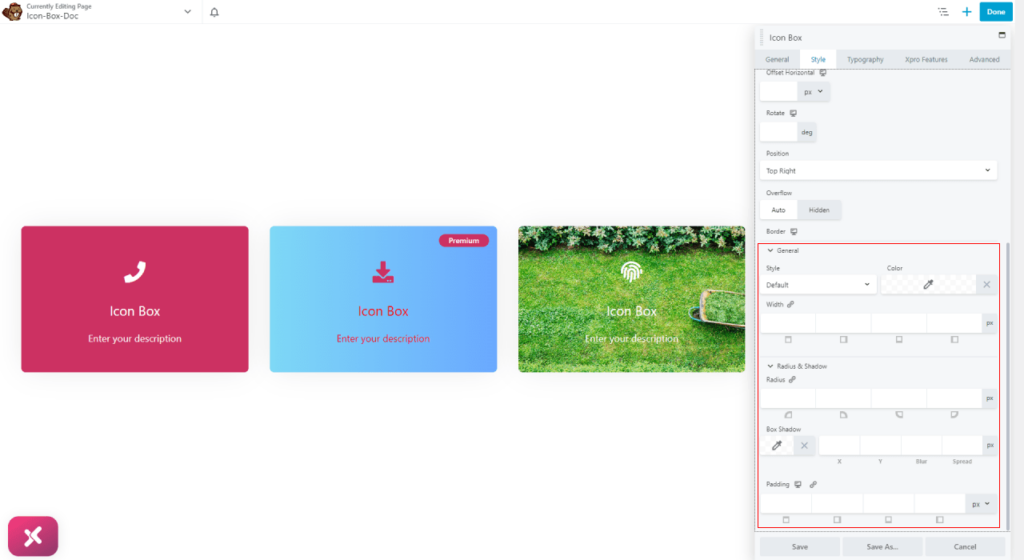
You can also create a border around the badge by simply selecting a border type and further, you can perform customization to the border and add a shadow.
How to Style Typography
Personalize the text display and make it appear the way you want it to. The typography tab allows you to change the text font, size, boldness, and much more for the title, description, and badge.
Start the text customization by selecting font type, size, weight, alignment, and line height.
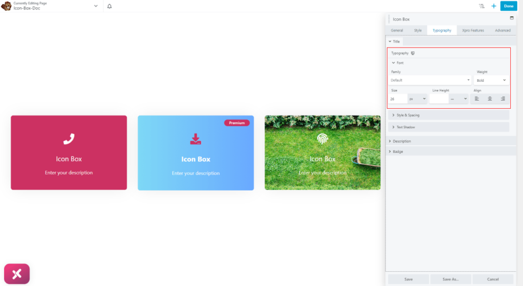
Further in the typography tab, you have the option to style the text by making space between characters and transforming their size. Just like with the boxes, you can also create a shadow effect for the text as well.

Best Icon Box Module for Beaver Builder
This was all from the documentation of the Beaver Builder Icon Box Module. We hope that you now have a full understanding of the application and uses of this powerful tool. If you like this widget then check out our free Info Box module that allows you to create visually appealing information boxes.
The Xpro Beaver Builder Addon is a powerful tool that enables web developers to create appealing, functional websites without the need for any coding. With over 70 Beaver Builder Modules, you have a wide selection of customizable tools that can help you form any kind of website. Whether you want to create a simple landing page or a complex e-commerce site, the Xpro Beaver Builder Addon has you covered.
