The Beaver Builder Dual Button module is a creative Xpro tool that allows you to display a pair of buttons separated by a line or text. This unique call to action (CTA) module is perfect when you are offering two choices to your website visitors. Incorporate this powerful module into your WordPress website and unlock new levels of user engagement and interactivity.
Whether you’re offering options, promotions, or calls to action (CTAs), this module offers a unique and captivating way to entice and interact with your audience with advanced customization options. Personalize each button individually by providing separate links, colors, typography, border, and much more.
How to Install Dual Button Module for Beaver Builder
In order to use the Dual Button module, install and activate the pro version of Xpro Beaver Builder Addons. If you already have the plugin installed, make sure the Dual Button is enabled from the Xpro Addon dashboard, so that you can find and use it in the Beaver Builder Editor.
To enable the Module, simply follow these steps.
Step 1
Click on the Xpro Addon section in your WordPress dashboard.
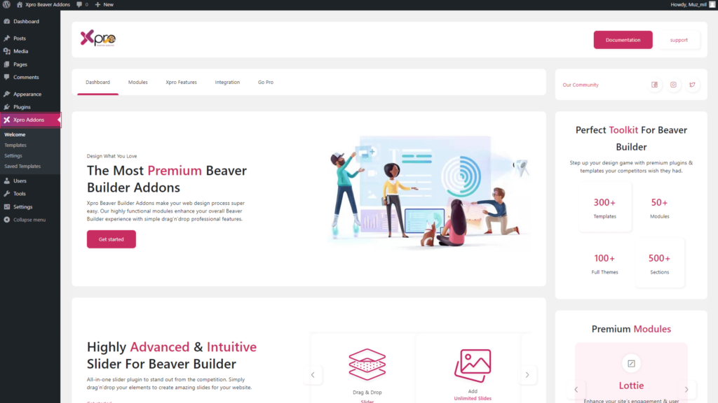
Step 2
From the Xpro Addon dashboard, click the Module Tab, Locate, and toggle on the Dual Button.
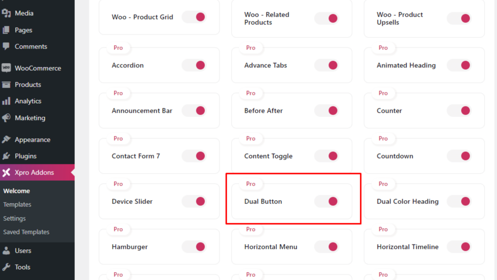
How to Use Beaver Builder Dual Button Module
Experience the effortless functionality of the Xpro Dual Button module, designed to simplify your website customization process and entice your visitors. Use the Beaver Builder drag-and-drop feature to simply incorporate the dual button module anywhere on the page. Our user-friendly interface allows you to effortlessly create and customize dual-button layouts within minutes.
Let’s discuss it at length.
Step 1
Open the Beaver Builder Page Builder, click on the “+” sign, within the module tab click on the group to open a drop-down menu, and select Xpro Addons.

Step 2
Select the icon box widget and drag’n’drop it to the desired page location.

General Setting
Once you have placed the module onto your desired page, an intuitive section will emerge on your screen, offering a range of customization settings for the module Within the first tab, labeled “General,” you have the option to add compelling text and icons to each button. Furthermore, you can easily assign links to each button, so that when your visitors click on it, they are seamlessly directed to their intended destination.

Click on the Yes option to show an icon of your choice. After selecting an icon from the icon library you have a choice to place the icon before or after text. Moreover, below the icon option, you will find a field to add a custom id for the button.

How to Style the Beaver Builder Dual Button Module
After adding all the necessary content and linking to the Dual Button Beaver Builder, head over to the style tab to personalize the CTA design. Set the alignment of the module to the left, right, or center of the section. Adjust the width of the button and create space between each button. Furthermore, enable the widget on mobile or tablet.

You have a choice to add a separator between two button modules by simply clicking on the show or hide option. Add text in the separator and adjust the size of its background. Enhance the visual impact by adding custom text in the separator and controlling the background size.

If you have selected to showcase text within the separator then you have the option to customize its typography. In the typography section, you will view three submenus of font, style & spacing, and text-shadow. Under the font submenu, you have the option to perform several text styling such as selecting font style, weight, size, line height, and alignment.

Following the font, in the style and spacing section you have the option to adjust space between letters and decorative styling such as transform, line decoration, style, and variant.

In the text-shadow submenu, add a color of the shadow effect and manage its position by moving it to the x-axis and y-axis of the separator. Furthermore, adjust the blur level of the shadow effect.

Under the typography section, select a color for the text and background in the separator.

In addition, you can create and customize the border around the separator. Simply add a border by selecting a border style between solid, double, dashed, and dotted. Customize the border by adjusting its width, radius, color, and shadow.

How to Style Dual Buttons Individually
Under the general menu, you can view a menu for button 1 and button 2 so that you can customize the design of each button separately. This allows you to exert precise control over the design of each button, tailoring them to your exact specifications. By accessing these individual menus, you gain the ability to personalize various aspects of the buttons’ design including typography, colors, border, and icon.
The styling process starts with typography from where you can change the text font, thickness, spacing, alignment, and much more. Moreover, you can create a shadow effect from the text-shadow option.

Elevate the engagement and interactivity of your buttons by incorporating captivating hover effects. Within the customization options, you can select distinct colors for the text in both the normal and hover states, ensuring an eye-catching transition as visitors interact with the buttons. Like the text, select normal and hover color for the background which gives you a choice to add gradient colors as well.

Select a border style that aligns with your desired design aesthetic. Additionally, you have the flexibility to adjust the border radius, allowing you to achieve either sharp or rounded corners, depending on your preference. Furthermore, customize the border color and width according to your liking. Add more touch of interactivity and attractiveness by adding a hover border color effect and shadow effect.

If you have incorporated an icon alongside the text within the button, you have the ability to further customize its appearance. Within the module’s settings, you can easily adjust the size of the icon and background to achieve the desired visual balance with the text. Furthermore, you can add color for the icon and background for their normal and hover display.

If you want to design a background for the icon then you have a choice to add and modify the border. Simply select a border type and customize its radius, width, color, and shadow.

Best Dual Button Module for Beaver Builder
This is all from the documentation of the Beaver Builder Dual Button Module by Xpro Addons. We hope that by now you have a full understanding of the functionality and uses of this powerful module. Integrate this widget into your website to provide two choices to your visitors.
The Xpro Beaver Builder Addon is a powerful tool that enables web developers to create appealing, functional websites without the need for any coding. With over 70 Beaver Builder Modules, you have a wide selection of customizable tools that can help you form any kind of website. Whether you want to create a simple landing page or a complex e-commerce site, the Xpro Beaver Builder Addon has you covered.
