Free Module
Hover Card Module For Beaver Builder
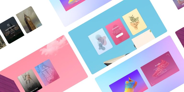
Create exciting hover cards to Showcase useful information on your website with our FREE hover card module for beaver builder. It comes with custom effects, 12 unique layouts, gradient Overlay & CTA link option.
Different <span style="color:#cc3162"> Layouts & Styles</span>
Select different layouts & styling options to make your hover card visually appealing and attention-grabbing.
Styles
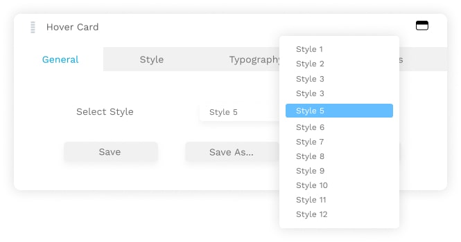
Choose Between 12 Different Styles
Choose different hover card layouts between 12 unique layouts and style them with your own choice to make them consistent with your website's branding or design.
Overlay
Put Color Or Gradient On Your Card Overlay
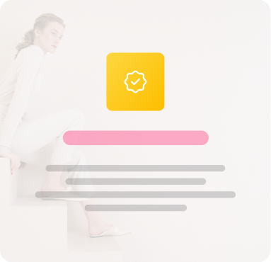
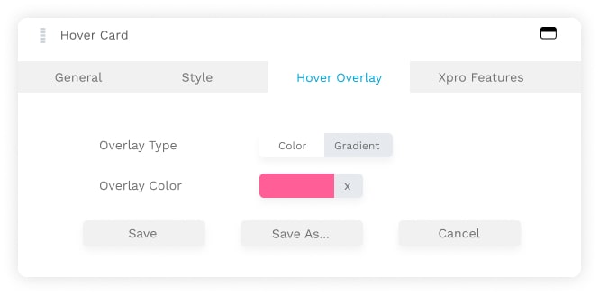
Spice up your hover card by adding color or gradient overlay. Xpro hover card allows you to modify the colors, fonts, gradients, and other design elements to match your website's style.
Link
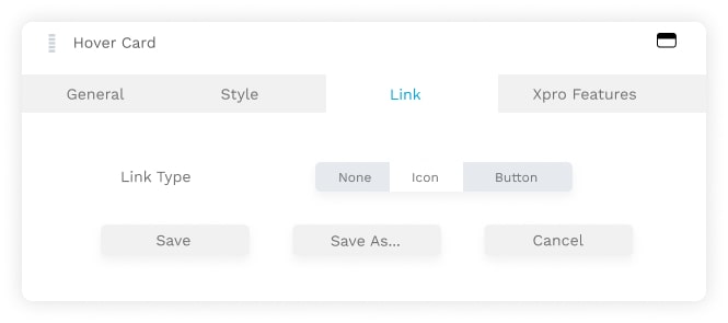
Put Icon Or Button As Call To Action Link
Use the Icon or Button as call to action link and entices users to click and explore further. By providing enticing previews or snippets of content, you can increase click-through rates and encourage users to explore deeper into your website

Vida Flora
From Engagement to Excitement – Transform Visitors into Customers with Hover Card CTAs.

Ava Sophia
Empower Your Content, Amplify Your Results – Add Iconic Calls-to-Action with Hover Card Module!

Elia Navy
By using buttons as call-to-action links on your hover cards, you can guide your visitors toward the desired actions and boost your conversion rates.
Place Icons Related To <span style="color:#cc3162"> Your Content</span>
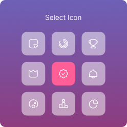
Use icons related to your services or products for users to quickly understand the available
actions and can gain insights without explicit explanations.
Link
Put Icons To Emphasize Your Content
Make your hover cards more engaging, informative, & user-friendly by emphasizing your content with icons


Hover Overlay
Put Color or Gradient On Your Card Overlay On Hover
Make your website energetic by adding color or gradient on hover card overlay. if you want to learn more about hover card module, you might check our blog post for the top reasons why use hover card module for Beaver Builder.
Modernism
Simplify complex information by presenting it in bite-sized, interactive hover cards.
Modernism
Ditch the ordinary and make your website extraordinary with Hover Card Module. Its innovative design will make your website shine.

Modernism
Take your Beaver Builder website to new heights with Hover Card Module. Enhance your design capabilities and create memorable experiences that leave a lasting impression.
Frequently Asked Questions
What is hover card?
Hover card is a popup window that appears when the mouse is placed over an icon on the screen for a short period of time, without clicking.
How do I add a hover card module in Beaver Builder?
To add a hover card module, simply open the Beaver Builder editor page, select the desired section or column where you want to add the hover card and click on the "+" button from the left top corner to add a new module. Search for the hover card module in the module library and drag it onto your layout. For further detail, you might check out latest guide on how to configure hover card module for Beaver Builder.
Can I customize the appearance of the hover cards?
Yes, you can customize your hover card colors, fonts, backgrounds, hover effects, and more. It allows you to match the hover card design with your website's branding and style.
Can I add images or icons to the hover cards?
Yes, you can add images or icons related to your content. Beaver builder hover card supports image and icon integration. You can upload images to be displayed on the cards, or choose icons provided by Beaver Builder.
Can I include links or buttons in the hover cards?
Yes, you can add links or buttons to the hover cards for CTA (call to action). It allows users to perform specific actions when they click on the card.
How many hover card layouts are available in Beaver Builder?
Beaver Builder offers a variety of hover card layouts to choose from. The exact number may vary based on the version of Beaver Builder you are using, but typically there are multiple pre-designed layouts available to suit different design preferences and content needs.
If you want to explore multiple pre-designed hover card layouts for your beaver builder website, download Xpro beaver builder addons - FREE pack.


