- How can I add the hover card module to my Beaver Builder website?
- What customization options are available for the hover card module?
- Can I use the hover card module on any element within Beaver Builder?
- Is the hover card module responsive?
- Can I use custom CSS with the hover card module?
- Is hover card module for beaver builder free or paid?
Introduction
Are you tired of your web pages looking flat and uninspiring? or looking for a module to add a touch of interactivity to your Beaver Builder website? Look no further! Here we’ll introduce the hover card module for beaver builder that allows you to create captivating hover effects on your website.
With this powerful module, you can grab your visitor’s attention by displaying additional information or content on hover card when they hover over a specific card. The best thing to consider for this module is time-saving because you don’t need to write a line of code or technical expertise.
Just imagine the possibilities with this module: stunning image previews with descriptions, helpful tooltips, or even interactive call-to-action, all triggered with a hover card.
Hover Card module for Beaver Builder allows you to customize the appearance of your hover cards by tailoring the background color, text style, hover overlay, and more to match your website branding. In this article, you will learn why you should use hover card module for beaver builder.
So, let’s dive in and discover the endless possibilities of the hover card module in action.
What is Hover card Module?
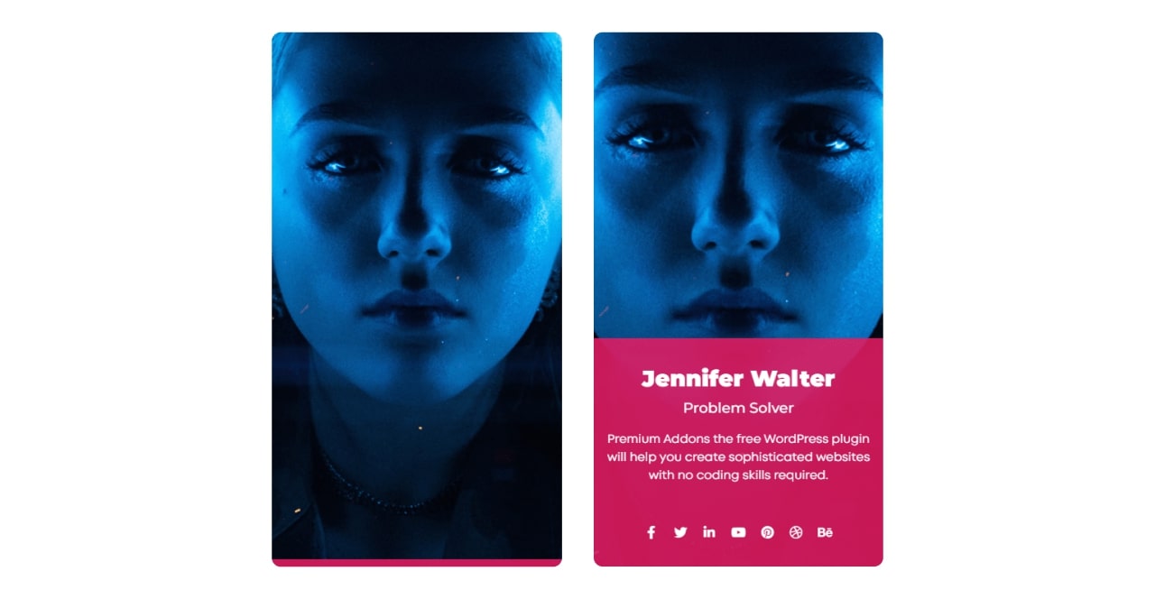
Hover card is a popup window that is neither a tooltip nor a traditional popup, but is a popup that appears when the mouse is placed over an icon on the screen for a short period of time, without clicking on it. It provides quick previews or details without requiring the user to navigate away from the current page. It appears dynamically and disappears when the cursor moves away. With this, you can display various types of content such as text, images, and CTA.

Hover card module for beaver builder provides a convenient and interactive way to display information on a website. It allows you to categorize information effectively. Instead of cluttering the page with excessive text, the hover card module enables users to access additional information by hovering over a specific section. It can help to minimize the need for scrolling through lengthy pages.
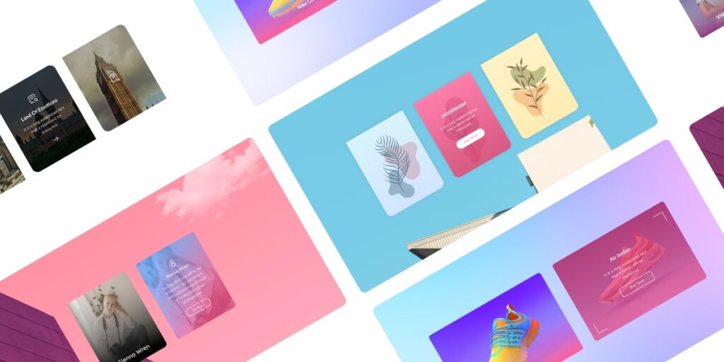
Trying using Xpro hover card module for beaver builder, it offers 12+ stylish layouts to match your website design and customizable settings for each hover card. It allows you to define the content, styling, and actions associated with the hover card. With this, you can customize the appearance of hover cards by adjusting settings such as the background color, text color, border style, and hover effects. The content inside the hover card can include text, images, buttons, icons, or CTA.
Hover Cards vs. Tooltips: which one is best for website?
Both hover cards and tooltips are useful for providing additional information or context to users on a website.
Here you will get to know in detail which one is best to showcase the useful information in a professional manner.
Hover Cards:
Hover cards, also known as hover overlays or hover boxes appear when a user hovers their mouse over a specific element on the page. They typically display information, images, icons, buttons, or actions like a CTA related to the element being hovered over.
Did you know? Hover cards are visually engaging and can provide more extensive content with images or CTA compared to tooltips.
When to use Hover Cards:
- Add hover cards to display more detailed information or content.
- Use to include images or media related to the text description
- To add additional information that needs to be visually prominent.

Tooltips:
Tooltips are small contextual messages that appear when users hover their mouse over an element to get the information but do not require a click. They are commonly used to provide brief explanations of the component being hovered over without distracting the user from the main content.
When to use Tooltips:
- Use to provide short, concise information or descriptions.
- Use to offer explanatory text for specific terms or features

The choice between hover cards and tooltips depends on the content and the level of detail you want to present.
But Suppose you want to showcase your portfolio, build a professional website with CTA, display useful information with images, or run an e-commerce store to display your products with descriptions. In that case, hover cards will be a better choice. Because they will undoubtedly boost user experience and keep visitors engaged to make your website stand out from the crowd!
Try using our Hover Card module for Beaver Builder today and unlock a new level of interactivity.
Why Use Hover Card Module For Beaver Builder: Top 9 Reasons
Before giving you the top reasons, I want to give you a real-time example of a hover card module for better understanding.
Consider yourself as a customer, you are browsing an online clothing store and you come across a collection of trendy shirts. As you hover over each shirt, a sleek and stylish hover card appears, providing you with key details such as the brand, price, available sizes, and even customer reviews. You don’t have to navigate away from the main page or open a new tab to gather this information. It’s all conveniently presented with hover card module. With a quick glance, you can compare different shirts design and make an informed decision without any hassle. It can save time to scroll on different pages.
Another example can be seen on a recipe website. As you scroll through a collection of mouthwatering dishes, hovering over a specific recipe triggers a hover card that showcases a food photo, recipe’s name, and a brief description. Then, You can click on the hover card to expand it, revealing the complete recipe with detailed instructions and ingredient lists. This interactive hover card module not only entices your taste buds but also saves you from endlessly scrolling through lengthy recipe pages.
By utilizing hover cards, websites can enhance the browsing experience, provide quick access to essential information, and captivate visitors with interactive and dynamic content.
So now let’s move on the main topic to discuss the reasons why you should use hover card module for beaver builder website:
Versatile Content Display:
With Hover Card module for beaver builder, you can showcase product images, portfolio items, team members, blog posts, or any other content want to highlight. It allows you to customize the content displayed in the hover card, giving you control over what users see.
Seamless Integration:
You can easily add hover cards to your existing Beaver Builder layouts without any coding or technical expertise with Hover Card module. It seamlessly integrates with Beaver Builder (a popular drag-and-drop page builder for WordPress)
Mobile-Friendly Design:
In today’s mobile-dominated world, it’s crucial to have a responsive website. Hover Card module ensures that your hover effects work flawlessly on mobile devices, providing a consistent and engaging experience for all users, regardless of their device.
Increased Click-through Rates:
With Hover cards, you can increase click-through rates by offering users a sneak peek of the content. This can be particularly useful for driving conversions, as users are more likely to click on a card that captures their interest.
Easy Customization Options:
You can easily customize hover cards according to your website design because Hover Card module provides a range of customization options to match your brand’s aesthetics. With this, you can customize the size, shape, color, and typography of the cards to align with your website’s design and create a cohesive look.
Enhanced User Experience:
Hover Card module for Beaver Builder provides an interactive and engaging user experience. It allows you to create dynamic hover effects that capture users’ attention and encourage them to explore your content further.
Increased Engagement:
You can increase user engagement by incorporating hover cards into your Beaver Builder layouts. When users hover over a card, they are presented with additional information or a preview of the content, enticing them to click and delve deeper into your website.
Time-Saving Solution:
Building hover effects from scratch can be time-consuming and require coding knowledge. Hover Card module streamlines the process by offering pre-designed templates and intuitive customization options. You can create impressive hover effects in a fraction of the time it would take to code them manually.
Improved Content Organization:
Hover cards can be a practical solution for organizing and presenting content, especially when dealing with large amounts of information. By using hover cards, you can condense content and provide a more organized and visually appealing browsing experience for your users.

Avoid Some Common Mistakes When Using Hover Card Module For Beaver Builder:
When using the Hover Card module, avoid some common mistakes to ensure optimal usage and effectiveness. By avoiding these common mistakes, you can enhance the effectiveness of Hover Card module and create a positive user experience that engages and delights your website visitors. Here we will elaborate some common mistakes to avoid:
Poor Card Placement:
Avoid hiding important content or placing the cards in obscure locations. Ensure the cards are easily discoverable and positioned logically within your page layout.
Lack of Visual Consistency:
Ensure that hover cards match the overall visual style of your website. Use consistent color schemes, typography, and design elements to maintain visual harmony.
Unclear or Insufficient Card Content:
The content displayed within the hover cards should be concise, informative, and relevant. Avoid unclear descriptions that don’t provide sufficient information. Ensure that the content within the cards aligns with users’ expectations and helps them make informed decisions.
Inconsistent Mobile Experience:
Test the hover effects on different screen sizes and ensure that they work well on touchscreens. If hover effects don’t translate well to mobile, consider implementing alternative interactions for mobile users.
Failure to Test and Iterate:
Always test your hover cards on different browsers and devices to ensure consistent functionality and appearance. Continuous testing and improvement will help you refine and optimize the hover card experience.
Best Practices and Considerations of Hover Card Module For Beaver Builder
If you want to captivate your audience and increase user engagement on your website then you need to follow these best practices and considerations for integrating hover card module on your web pages.
- Add captivating animations, eye-catching images, or intriguing text snippets to create an instant wow factor and keep users engaged.
- Place Hover Cards on your landing pages for product listings and highlight key features, discounts, or limited-time offers.
- Customize the appearance, color schemes, and animations to match your website design.
- Mobile responsiveness is crucial in today’s digital world. Hover Card Module is designed to be fully responsive, ensuring a consistent and engaging experience across all devices. Before publishing, check the cross-device compatibility.
Keep in mind that first impressions matter.
With this powerful module, you have the power to make a lasting impact on your audience. Don’t wait for another second. Elevate your website with the best practices and considerations of the Hover Card Module for Beaver Builder.
Winding Up!
That’s it! Hope you have got all the necessary information regarding hover card module for beaver builder. It is a powerful module that allows you to present information in a visually appealing and arranged format. It can also enhance the overall user experience by providing interactive and engaging content, encouraging users to delve deeper into your website.
By incorporating Xpro hover card module on your Beaver Builder website, you can captivate your audience, boost user interaction, and create a more immersive browsing experience. So, don’t hesitate to take advantage of the hover card module and unlock the full potential of your website.
For more styling features, you can explore some other Xpro beaver builder free modules such as heading module, drop cape module, info box module, and Info list module. If you like these modules, you should also discover Xpro Beaver Builder addons.
If you have any doubts or questions do ask us in comment section, we would greatly appreciate that!
Frequently Asked Questions:
How can I add the hover card module to my Beaver Builder website?
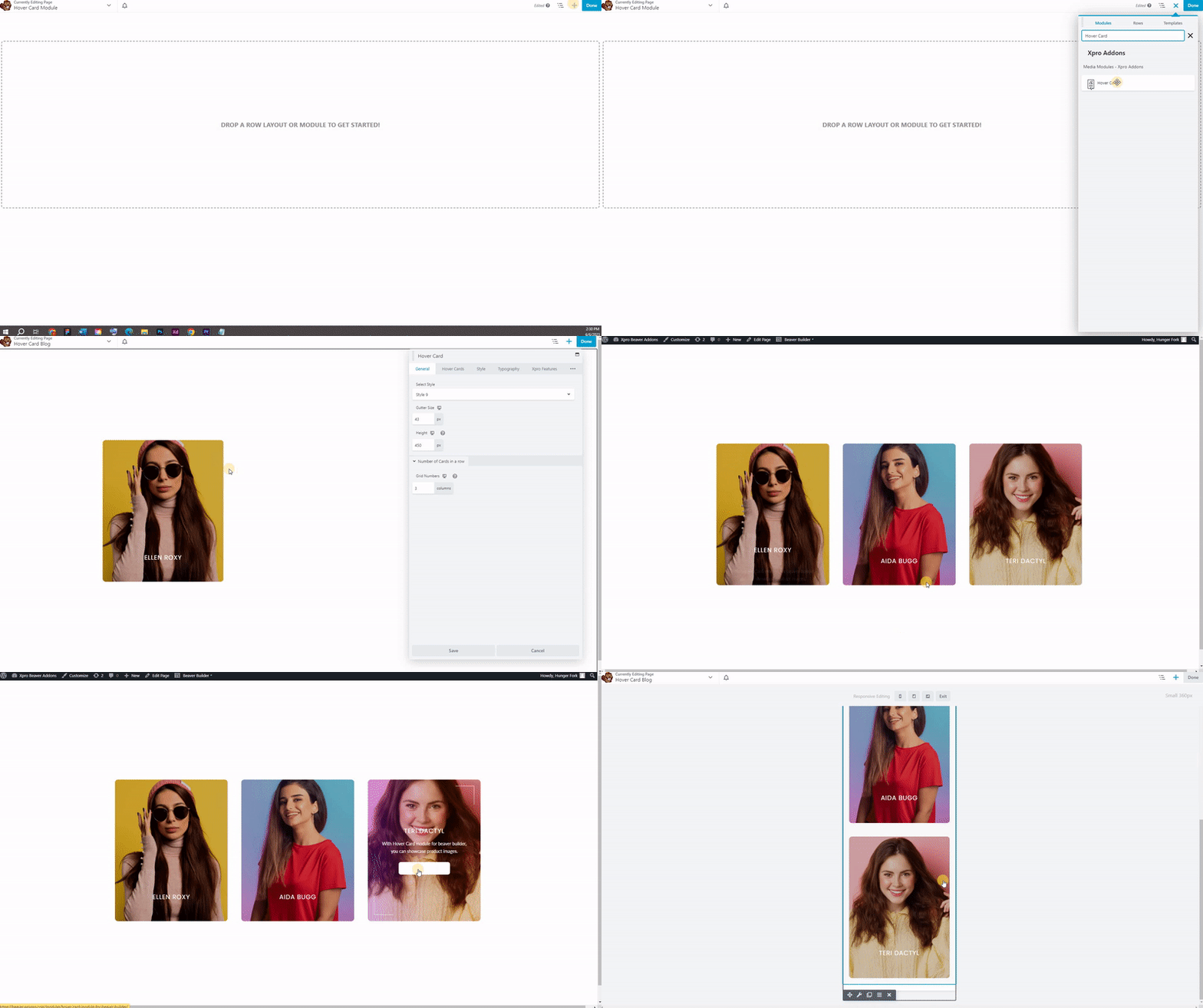
To add the hover card module to your Beaver Builder website, follow these steps:
- Open the page or post where you want to add the hover card module.
- Launch the Beaver Builder editor by clicking on the “Page Builder” tab.
- Click on the “+” button to add a new module and search for “Hover Card” in the module list.
- Select the Hover Card module and customize its settings and appearance according to your requirements.
You might check our latest guide on how to add and configure hover card module for beaver builder.
What customization options are available for the hover card module?
The hover card module in Beaver Builder offers various customization options, including:
- Content: You can add text, images, videos, or any other content to display within the hover card.
- Styling: Customize the background color, text color, borders, and other visual aspects of the hover card.
- Animation: Choose from a range of animation effects to apply when the hover card appears.
- Trigger: Set the hover card to appear when hovering over the module, a specific element, or when scrolling.
- Layout: Adjust the size, positioning, and alignment of the hover card on the page.
Can I use the hover card module on any element within Beaver Builder?
Yes, hover card module can be applied to various elements within Beaver Builder, including rows, columns, and individual modules. You have the flexibility to choose which element triggers the hover effect and specify the content displayed within the hover card.
Is the hover card module responsive?
Yes, hover card module in Beaver Builder is designed to be responsive. It automatically adapts to different screen sizes and devices, ensuring that the hover effect and content within the hover card are displayed correctly across desktop, tablet, and mobile devices.
Can I use custom CSS with the hover card module?
Yes, Beaver Builder allows you to add custom CSS to any module, including the hover card module. If you want to further customize the appearance or behavior of the hover card, you can utilize custom CSS to achieve your desired outcome.
Is hover card module for beaver builder free or paid?
You can get this module FREE from Xpro beaver builder free addons pack with multiple free modules, templates, and themes for beaver builder.

