Pro Module
Accordion Module for Beaver Builder
Simplify your website navigation! Show any detailed list of items in collapsed and condensed manner by using Xpro accordion module for beaver builder. With four unique accordion styles, customizable styling and typography options, and the ability to add images or videos, you can create an interactive and engaging user experience.


Style to <span style="color:#cc3162">Capture Attention</span>
Use accordion to avoid endless scrolling and style its content, labels and icons as you want to grab users’ attention. Choose from different styles, text colors, icon designs, and background colors. Add borders with radius and shadow effects, and customize icon size and color. Check our free beaver builder modules for further styling options.
Styles
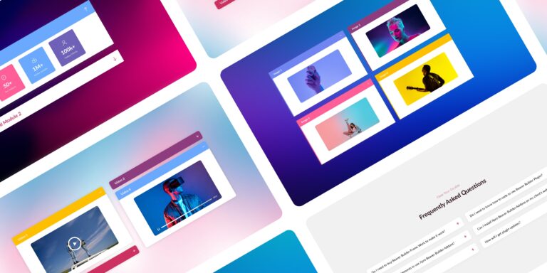
Explore Over 4 Different Accordion Styles
Don't settle for boring list items. Style them according to your audience and brand. Display your content in an interactive way to enhance user experience of your website. To learn more, check out our blog on the best accordion module for beaver builder.

Style 1
It is a long established fact that a reader will be distracted by the readable content.
Style 2
It is a long established fact that a reader will be distracted by the readable content.
Style 3
It is a long established fact that a reader will be distracted by the readable content.
Style 4
It is a long established fact that a reader will be distracted by the readable content.


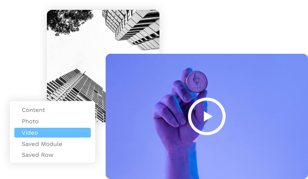
Content
Add various types of content, including images and videos
Xpro accordion module for beaver builder allows you to add wide range of content. Add text, images, videos, modules or even saved rows and make your website unique and memorable.
Video
Make accordion catchy by adding videos
Want to transform your accordion with captivating videos? Use Xpro accordion module for beaver builder to add videos in accordion and make your website more interactive.
video
video
Accordion

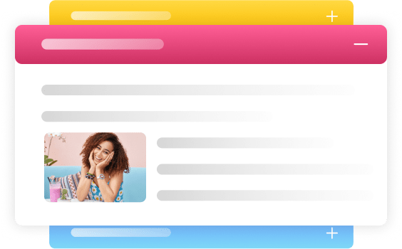
Image
Display Your Desired Images In Your Accordion
Let your images take center stage! Create Picture-perfect accordions that beautifully display your desired visuals. Showcase your desired images with elegance and flair!
Content
Make your Accordion with any module or saved row
Unlock endless possibilities with Xpro accordion module for beaver builder! Build your perfect accordion using any module or saved row, tailored to your unique vision


Use variousy<span style="color:#cc3162"> typograph options </span>
Enhance your accordion with diverse font styles and options and make a lasting impression. Elevate your accordion's design with a wide range of typography choices to suit your message. For an easy way, you can also use our pre builtbeaver builder templates.


Label
Show your Accordion the way you want
Choose the way you want to display your list items. Display one item at a time or show multiple items at the same time. You can also expand the first item of your accordion by default.
Related Modules
Frequently Asked Questions
What is an accordion module?
An accordion module is a web design tool which is used to organize and display content in a collapsible and expandable format. It typically consists of a series of headings or titles that, when clicked, reveal or hide the associated content. This allows users to navigate through information in a compact and interactive manner.
What is the difference between accordion and toggle content module?
While both accordion and toggle content modules serve the purpose of hiding and revealing content, they differ in their presentation and functionality. An accordion module typically displays multiple collapsible sections with headings, allowing users to expand one section at a time while automatically closing others. On the other hand, a toggle content module usually has a single toggle button that alternates between showing and hiding the content, without the option for multiple sections.
How do we use accordion module for beaver builder?
To use the accordion module in Beaver Builder, follow these steps:
- Open the Beaver Builder editor for your desired page or post.
- Drag and drop the "Accordion" module from the module panel onto the desired section of your layout. We suggest you to use Xpro accordion module for beaver builder.
- Configure the module settings, such as the number of sections, titles, and content.
- Customize the styling and appearance of the accordion module using the available options.
- Add the desired content within each section, including text, images, or any other supported modules.
- Preview and publish your page to see the accordion module in action
To learn more, check out our latest guide on accordion module.
How can I ensure that my content toggle created with Beaver Builder is accessible?
To ensure accessibility, it is essential to provide clear and descriptive labels for the toggle button and to make sure that the hidden content is easily accessible to all users. Additionally, it is recommended to test the responsiveness of the toggle button on different devices.
Simplify Navigation with Accordion Module
You can now easily show any detailed list of items in a condensed manner and interactive manner