How To Use Creative Table Module For Beaver Builder?
Are you looking to enhance your website design and improve the way you present tabular data? Look no further. In this guide, we will walk you through the process of using Creative Table module for Beaver Builder. It is a powerful module that will help you create stunning tables with ease.
Tables are an essential component of many websites, whether you need to showcase pricing plans, product features, or comparison charts. However, creating user-friendly tables can be a challenging task, especially if you’re not familiar with coding or web design. That’s where the Creative Table module comes in.
With Xpro Creative Table module for beaver builder, you can create tables with multiple styling options, icons/images, and striped rows for assigning different colors of even and odd number rows. Whether you’re a seasoned web developer or a beginner, this guide will provide you step-by-step instructions.
In this guide, You will also get to know how you can optimize your tables for conversion and create designs that align with brand identity. By the end of this guide, you’ll have the knowledge and skills to create professional tables that will enhance your website’s user experience.
So, let’s jump in!
Requirements
Firstly, you need to install and activate the Xpro beaver builder addons- Lite. For installing this, Click on the “plugins” on the side menu and select “Add new.” Once done, type “Xpro Addons” in the search bar located in the top-left corner. After this, you’ll be displayed with multiple search results, as shown in the image below:

Locate “Xpro Addons for Beaver Builder- Lite” and click on “Install.”
After that, you need to purchase Xpro Beaver Builder Premium Pack and activate the license to use the creative table module. Because it is a pro module of Xpro Beaver Builder Addons.
If you already have the plugin installed, just make sure the creative table module is ‘Enabled’. This way, you can find it in the Beaver Builder page editor.
Here is how you can enable the modules for beaver builder.
How to Enable Creative Table Module For Beaver Builder?
To enable the creative table module for beaver builder, follow these steps:
Step 1
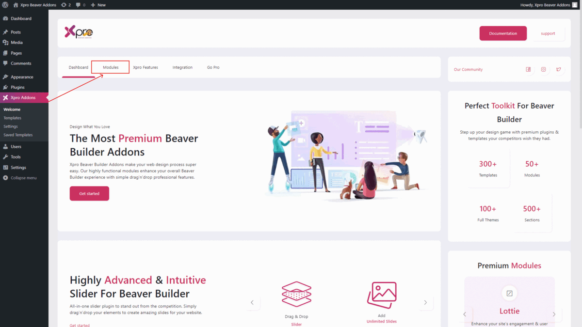
Click on the Xpro Addons option available on the WordPress Dashboard Menu.
Step 2
From the Xpro Addons Dashboard, click on the Module tab and find the creative table module. Toggle the button “ON” to enable it.
Steps to Use Creative Table Module For Beaver Builder:
To use the creative table module for Beaver Builder, follow these steps:
Step 1: Add New Page:
Once you have enabled it, return to your WordPress homepage. From there, navigate to the “Pages” section and choose the specific page where you would want to add a creative table module, and then launch Beaver Builder.
Step 2: Drag and Drop the Creative Table Module
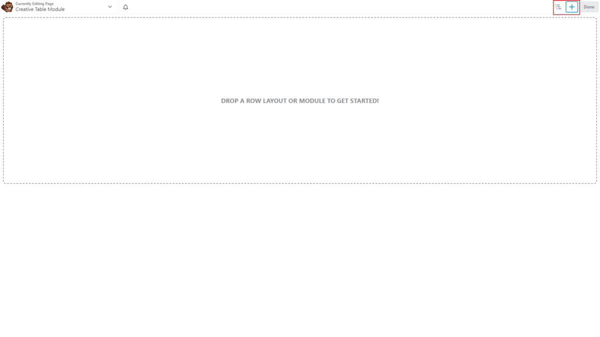
- Edit the Beaver builder and select Xpro addons from the side menu.
- Drag and Drop the creative table module on your selected area. It will be shown in the beaver builder editor.
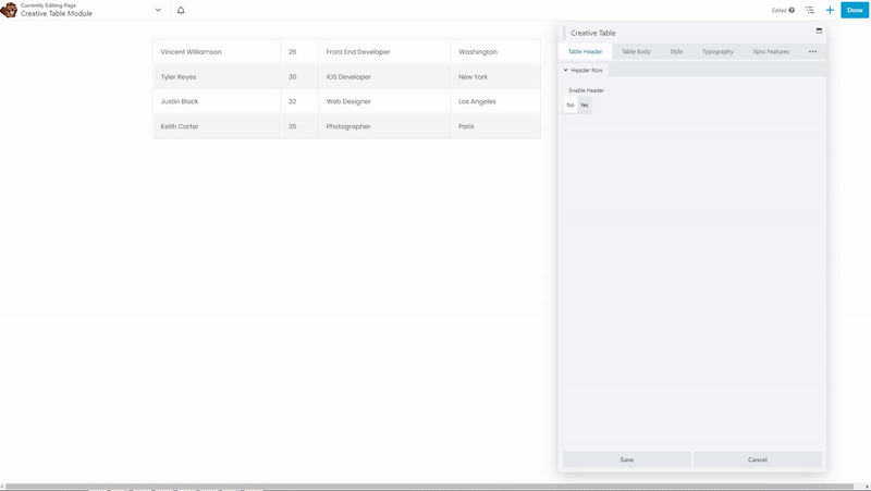
- This is the default look of our Xpro Beaver builder creative table module.
Step 3: Table Header
- In the table header section, you have the option to enable or disable the table header.
- Once enabled, you can customize it based on your preferences, including the ability to incorporate multiple lists of items within the table header.
- After adding the list, you can then proceed to individually edit each item within the list. Additionally, you have the option to duplicate, delete, and rearrange the items within the list as desired.
- After clicking on the “Edit” option for the item, you will find yourself in a section that offers two distinct tabs. The first tab allows you to configure general settings, while the second tab facilitates to apply custom styles.
Here, we will explain each section for editing the list.
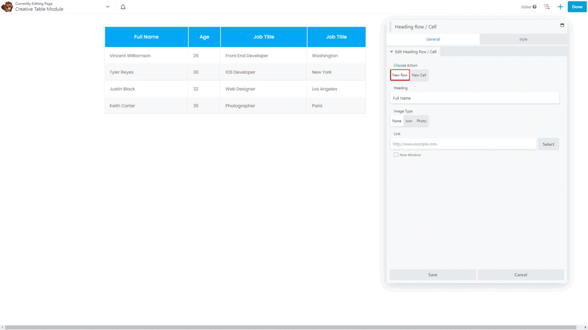
General Tab:
- Choose Action: Within the general section, you have complete control over selecting the desired action for adding a list of items to choose either a new row or a new cell based on your preference.
- Heading: You have the option to include content in the form of heading.
- Image type: With this creative module, you can incorporate images and icons with a heading and can customize their placement to position them either before or after the text.
- Link: You can insert link on your heading for CTA.
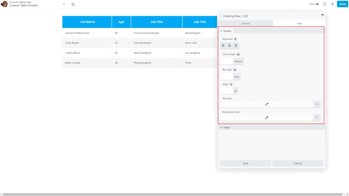
Styling Tab:
- General styling: Within the style section, you have the capability to configure various aspects such as content alignment, column, and row span settings (it allows you to adjust the table layout), header column or row width adjustments, and the ability to modify text color and background.
- Media Styling: Within the media section, you are provided with the option to stylize your images and icons. This includes the ability to alter their color, size, and spacing.
Step 4: Table Body
- Within this specific section, you are presented with the choice to add content by incorporating multiple lists of items within the table body.
- After adding the list, you can edit each item within the list.
- After clicking on the “Edit” option for the item, you will find yourself in a section that offers two separate sections. The first one is to configure general settings, while the second one is to apply custom styles.
General Section:
- In the general section, you have complete control over choosing a new row or a new cell based on your preference. Then, You have the option to include content.
- You can also add images and icons with content and can customize their placement as you have edited before in the table header. You can insert link on your content for CTA.
Styling Section:
- General styling: In this section, you can configure various aspects such as content alignment, column and row span settings, body column or row width adjustments, and the ability to modify text color and background.
- Media Styling: You have the ability to customize the appearance of your images and icons to modify their color, size, and spacing.

Step 5: Style Setting
Within the style settings, you will encounter five distinct tabs, namely general styles, header settings, body settings, header icon/image, and body icon/image. It provides specific customization options to enhance the appearance of the overall table:

General Settings: This tab allows you to fine-tune various aspects such as border-collapse, border-spacing, table-border, and table background color, enabling you to achieve a desired visual style.
Header Settings: In this tab, you can set vertical alignment, text color, background color, cell border, and cell padding specifically for the table header.
Body Settings: Body settings tab empowers you to adjust vertical alignment, enable or disable striped rows to assign colors for odd and even rows to create optic differentiation, set cells’ text color, add row colors, and define cells’ border and padding for the table body.
Header Icon/Image Settings: This tab enables you to personalize the appearance of header icons and images. You can change their colors, adjust their size, and modify attributes such as photo width or spacing.
Body Icon/Image Settings: Similar to the header section, this tab allows you to customize the appearance of icons and images within the table body, following the same styling options as for the header icons and images.

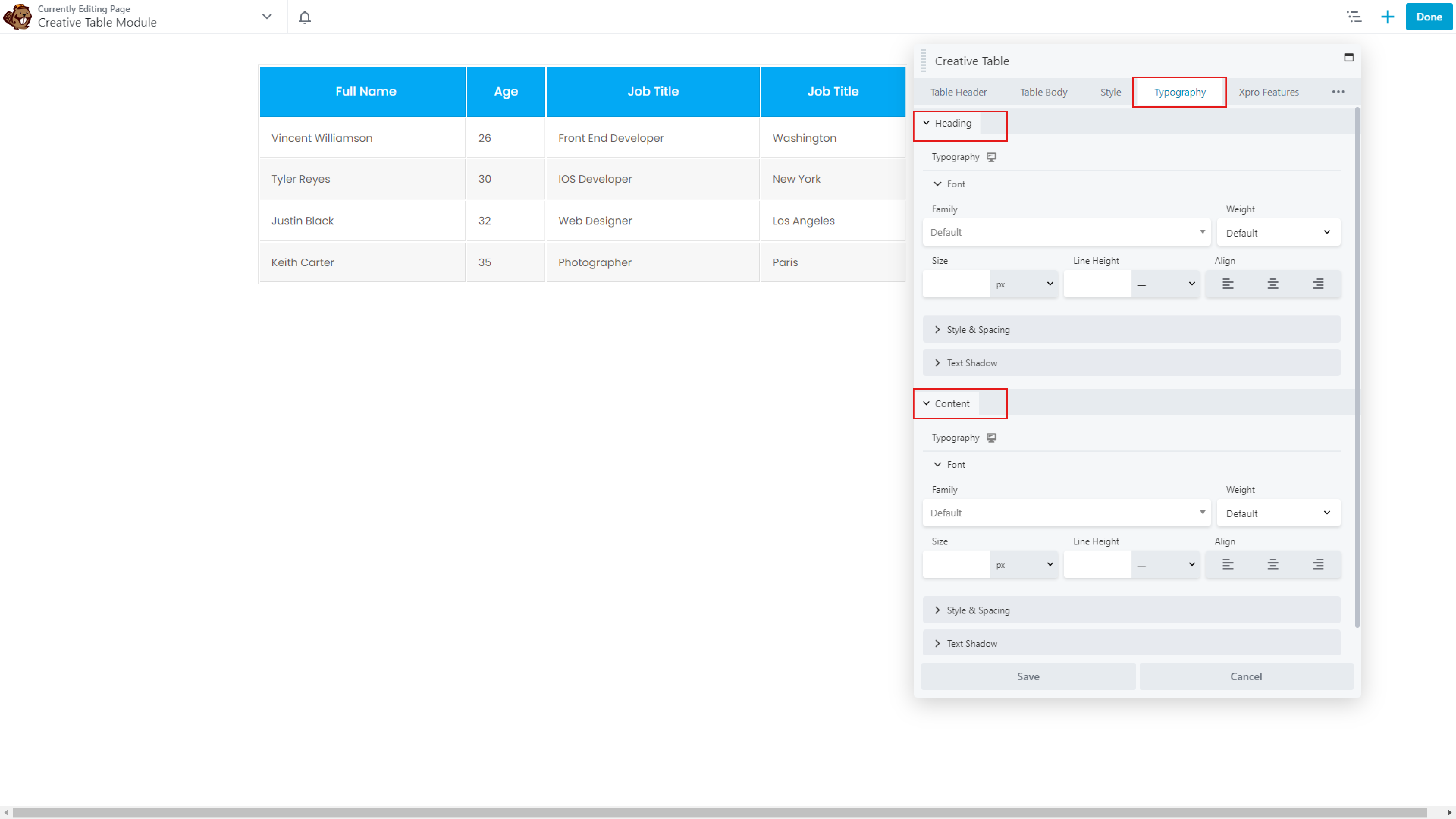
Step 6: Typography Setting
In the typography settings, you will come across two tabs: heading and content. Let’s explore each section:
Heading Section:
- Within the heading section, you have the ability to configure typography settings specifically for headings.
- You can assign font weight, size, line height, and adjust heading alignment, style, and spacing to achieve a unique presentation.
- Additionally, you can apply text shadow effects to make your headings stand out with a distinctive touch.
Content Section:
- The content section allows you to customize the typography settings for the body content of your table.
- Similar to the heading section, you can personalize the font weight, size, line height, and other typographic elements within the content.
- This provides consistency and coherence in the overall typography styling, complementing the customization applied to the headings.
Here’s A Look at What We’ve Done!
The result will look like this for every new visitor to your website.
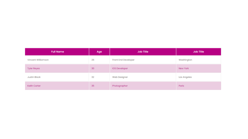
You can also apply different animations on your creative table module by using Xpro advanced features.
Best Creative Table Module For Beaver Builder
That’s it! Hopefully, this guide will help for a better understanding of how you can add and configure the Xpro Creative table module for Beaver Builder in WordPress.
As a result of this module, you can showcase complex data in a captivating manner. Effortlessly organize and highlight important information, such as product specifications, pricing plans, or team member profiles. Creative Table module empowers you to create dynamic and interactive tables.
So, what’s holding you back? Get the Xpro beaver builder addons premium bundle at an affordable price and get ahold of pro beaver builder modules, and templates.
Apart from that, Try using our FREE modules for Beaver Builder like heading module, info list module, drop cap module, and info box module to make your website without wasting your precious time.
If you need assistance or want to share your opinions with us, leave us a comment below. We’d greatly appreciate that!