How to Configure Accordion Module for Beaver Builder?
Want to display your content in a condensed manner on your website? If yes, then you should use the Xpro accordion module for Beaver builder to make an accordion that will simplify the navigation and reduce endless scrolling.
By using the accordion module, you can show your content by expanding and collapsing the text. This can help you to save your website space and to create a professional appearance on your website. If you want to show a list of items with details, then an accordion is a great way to show. By using accordion, you can make your information easily accessible without cluttering the main page. Accordion can be used for feature lists, FAQs, Q&A, support sections and service lists.
Xpro addons for beaver builder offer the best module to create an accordion. It is fully customizable and easy to use.
This guide will teach you how you can use the accordion module in your beaver builder website. Let’s get started!
Requirements:
First, install and then activate the Xpro addons for beaver builder- lite to use the accordion module for beaver builder.
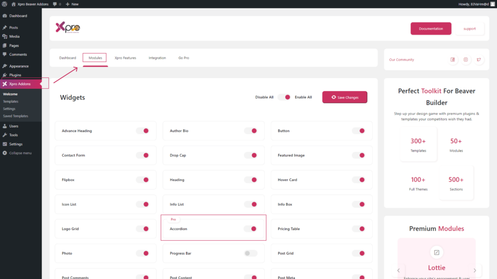
Before using the accordion module you should enable it from the Xpro module section.
(Xpro addons plugin-> modules-> accordion-> enable).
Steps to Configure the Accordion Module in WordPress for Beaver Builder:
To configure the accordion module for beaver builder, follow the steps given below:
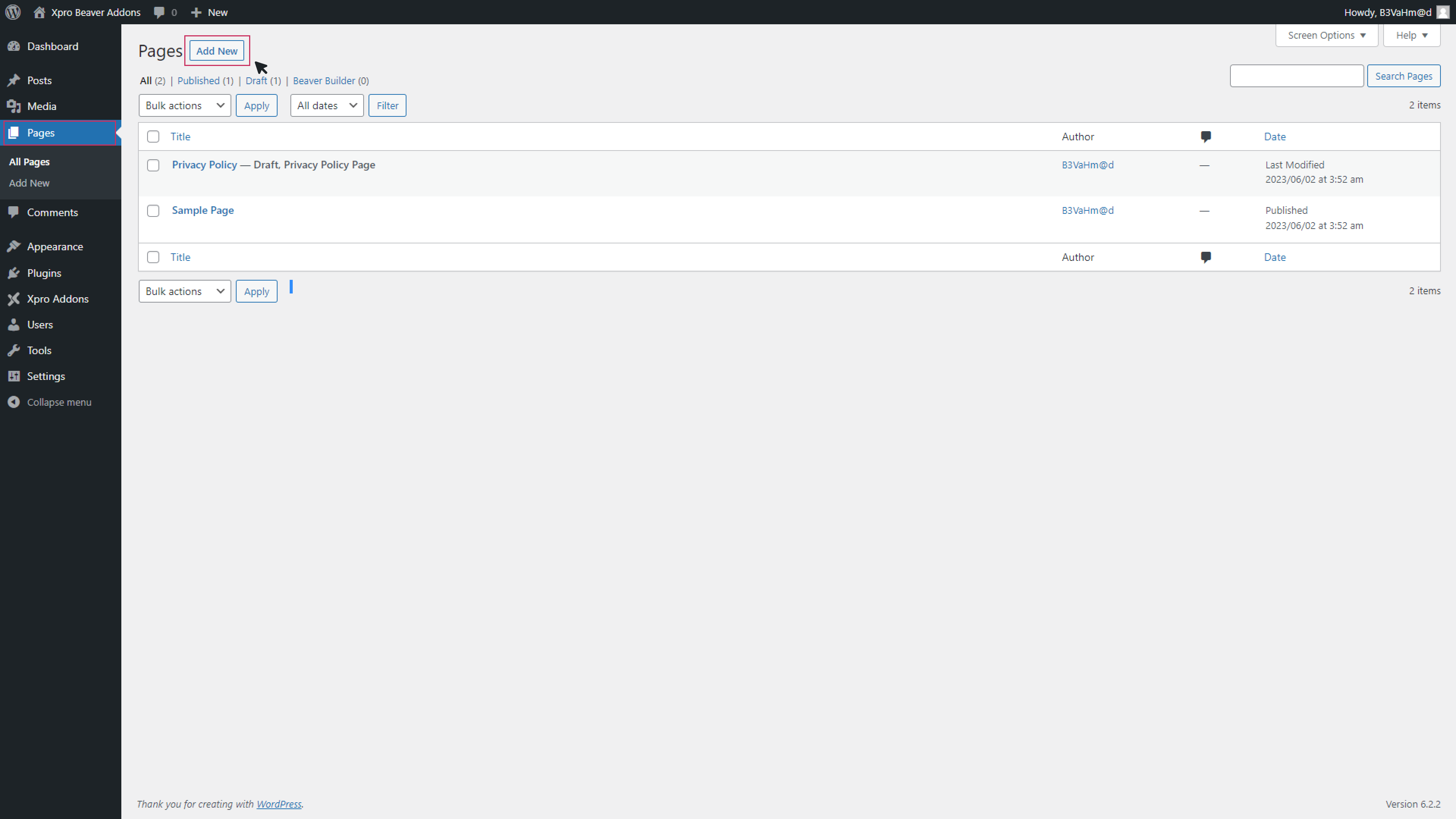
Step 1: Add new page
First, go to the WordPress dashboard to create the accordion module. Click on the “pages” from the menu on the left side. Now click to “Add new” at the top.
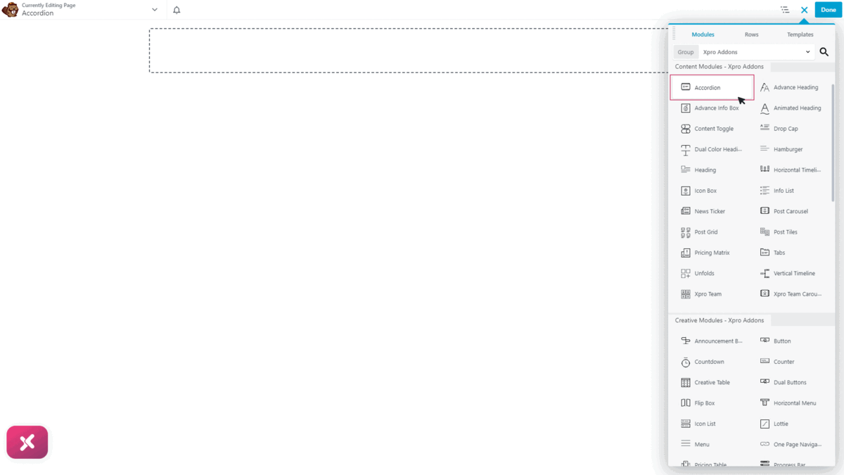
Step 2: Drag-n-drop the Xpro Accordion Module
Now go to the beaver builder editor page. Click on the “+” icon in the top right corner. This will open a side menu. Here you will search for the accordion module. Drag and drop the module on the editorial page.
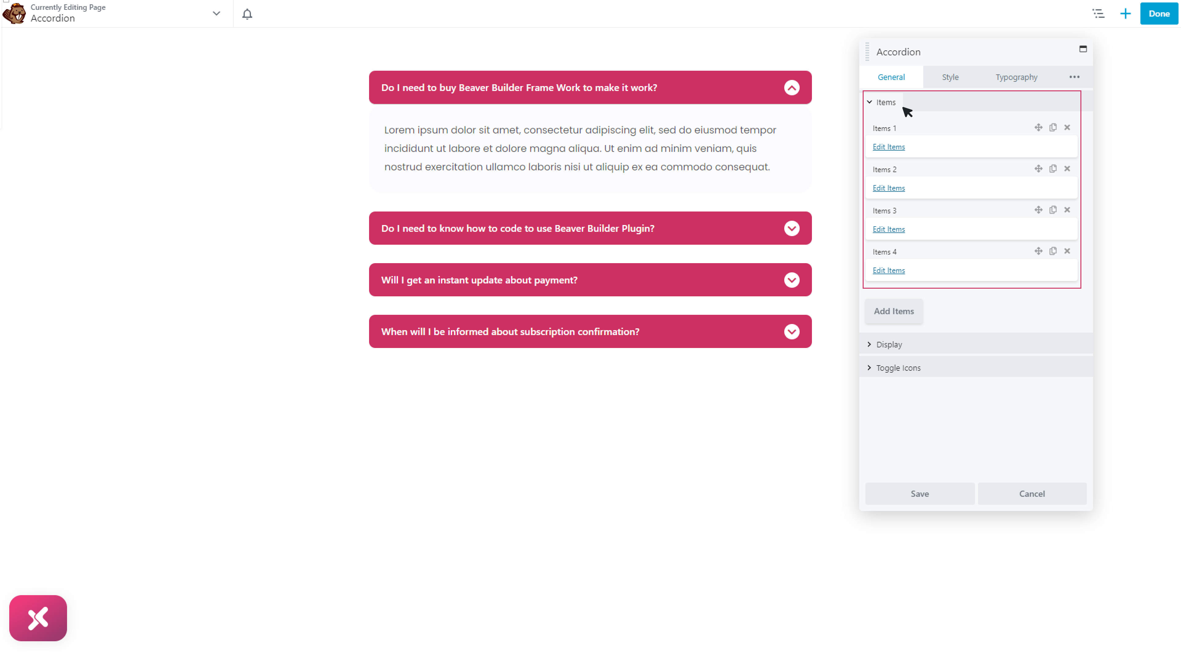
Step 3: General Settings
There are three sections in the general part. Let’s discuss them one by one:
Items:
In the first part you will add and edit items. To add items, just click on the “Add items” button. To edit the items, click on the “edit items” link. Now add text in the label section. Then write the hidden content for that label. You can also add images, videos, saved rows and modules.
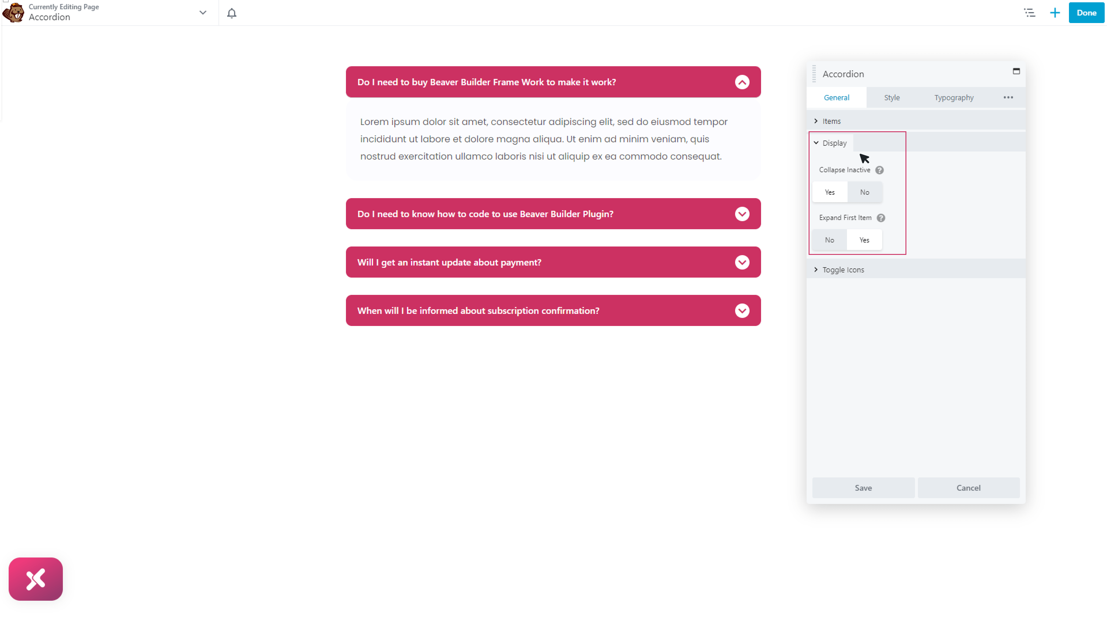
Display:
Select the option “yes” for “collapse inactive” if you want to keep only one item at a time. Choose “No” if you want to show multiple items at the same time. Choose “yes: in the “enable first item” if you want to expand the first item by default.
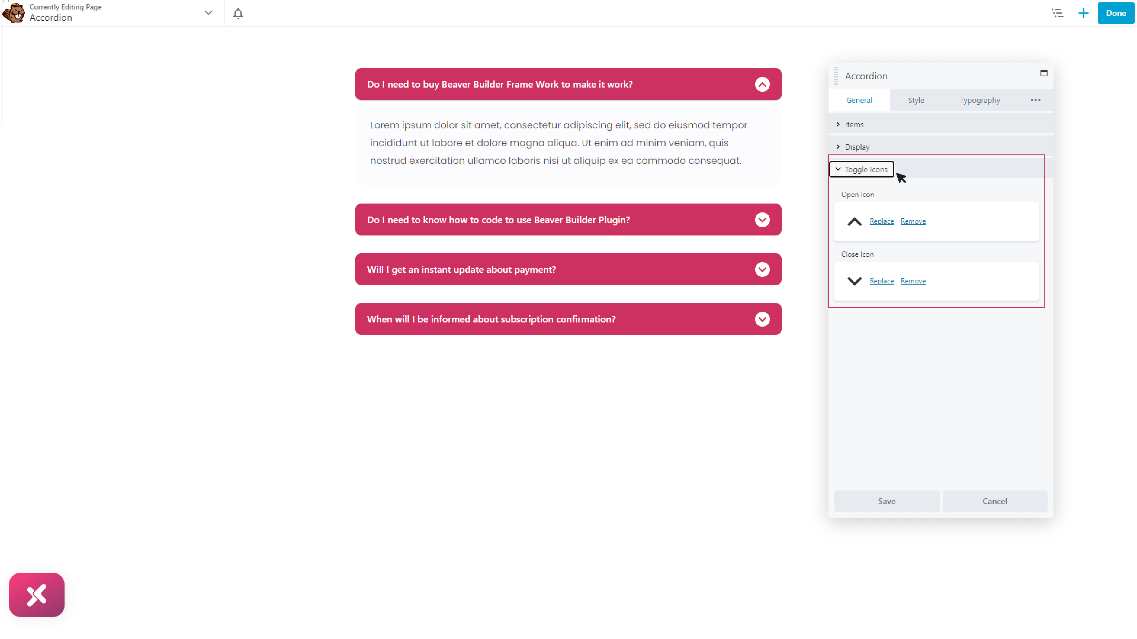
Toggle icons:
Choose the icons you want for both open and closed icons.
Step 4: Styling
In this section, you can style your items. There are four parts in this section:
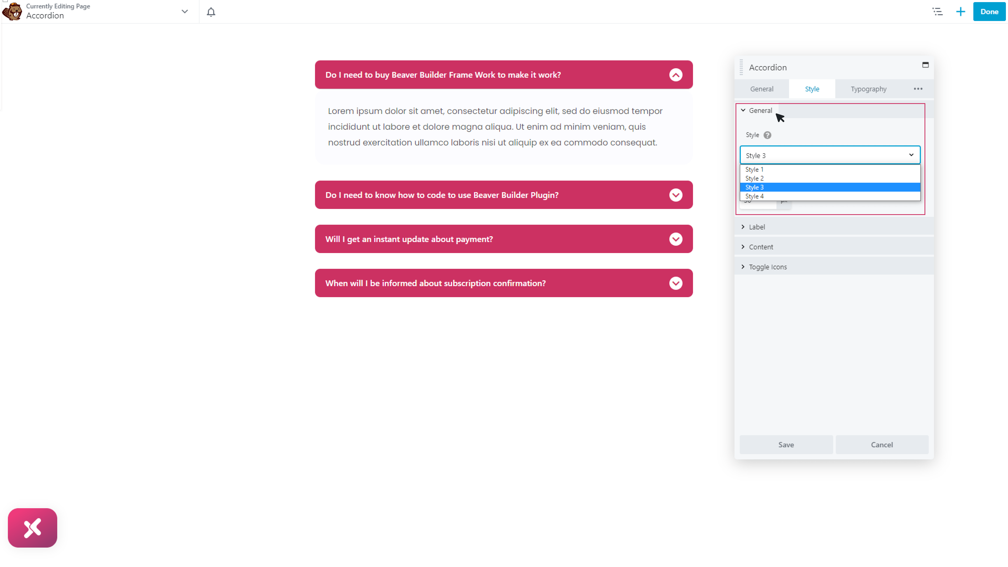
General styling:
Select the accordion style you want. There are four different styles available. After choosing the style, adjust the item spacing.
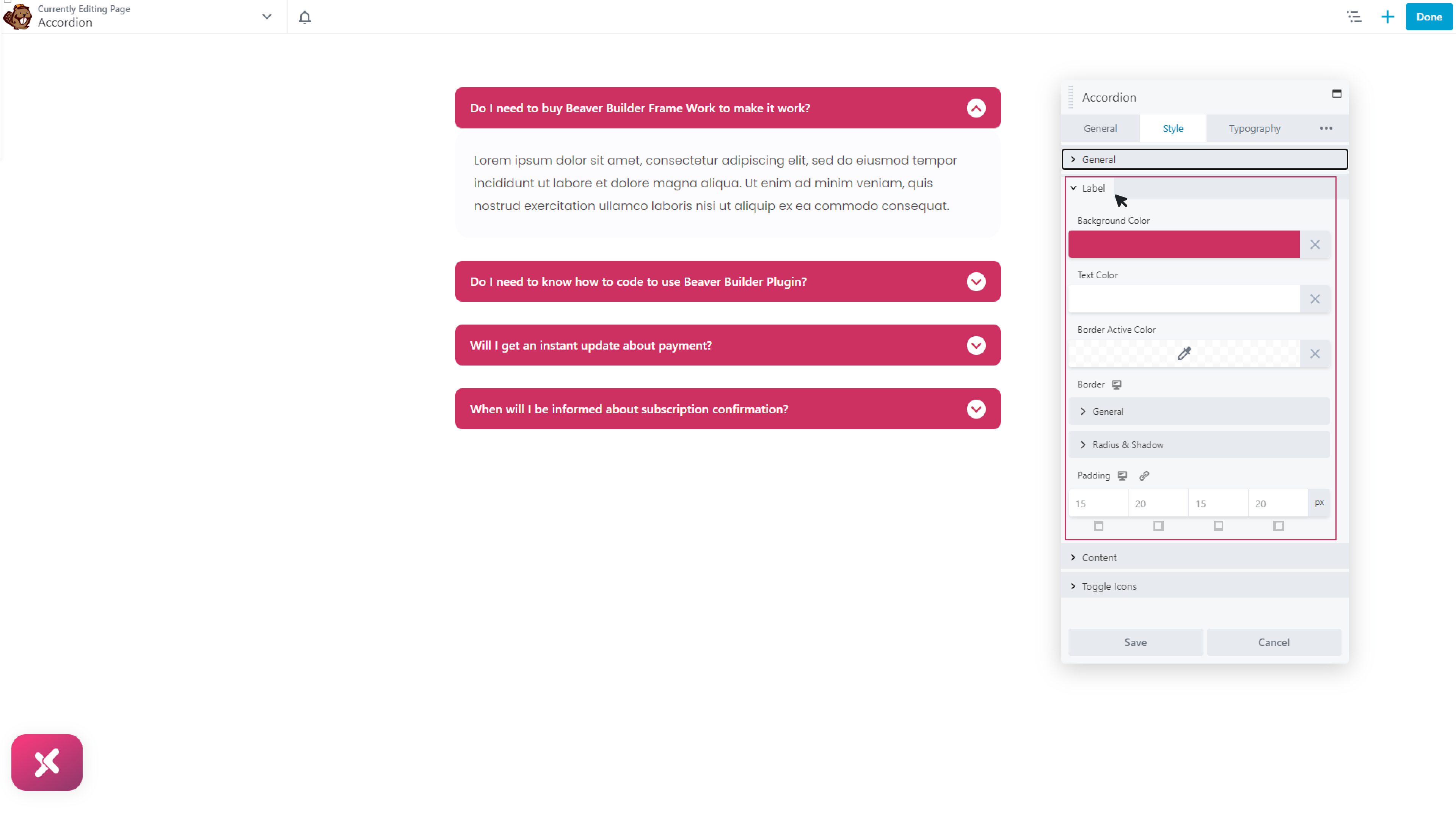
Label:
In this section, you can style the label for your items. Add text color, background colors, border, radius, shadow, and much more.
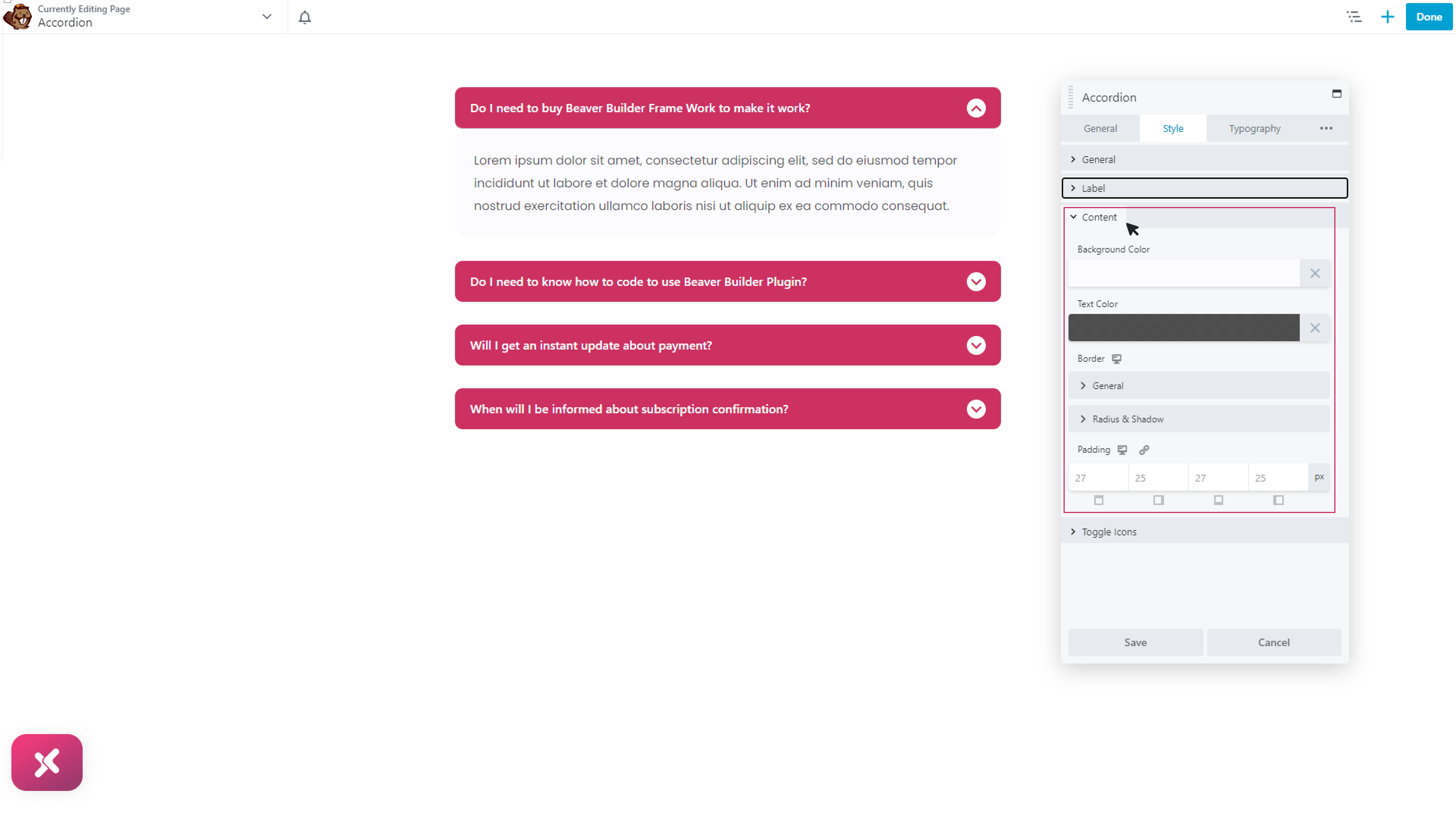
Content:
Now style the content part in the same way.
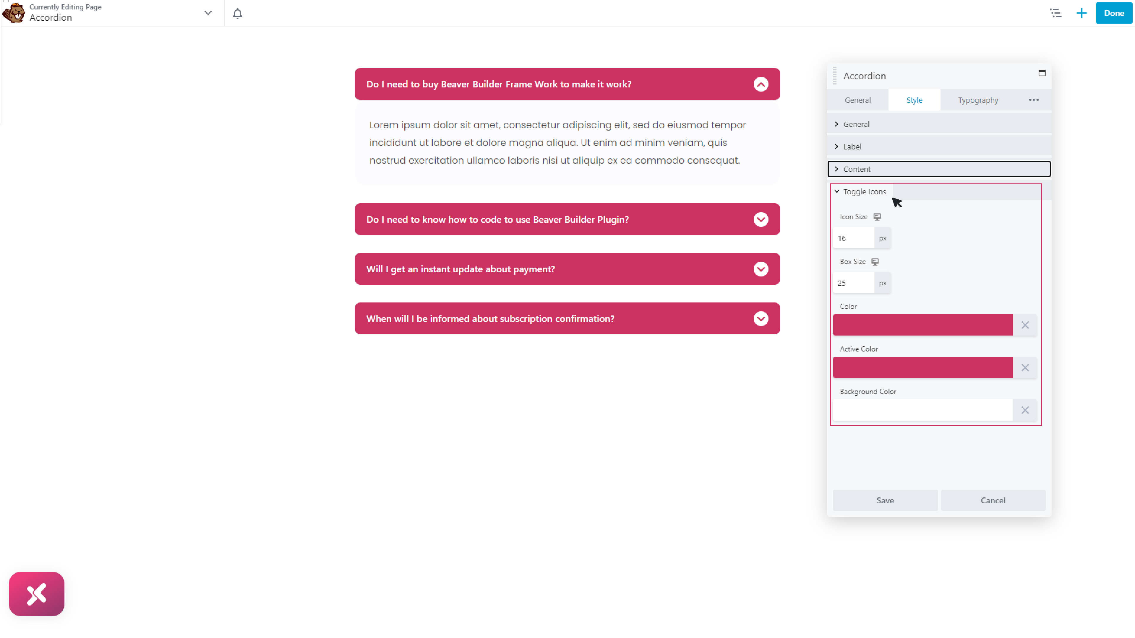
Toggle icons:
Now choose the color and size for your icons.
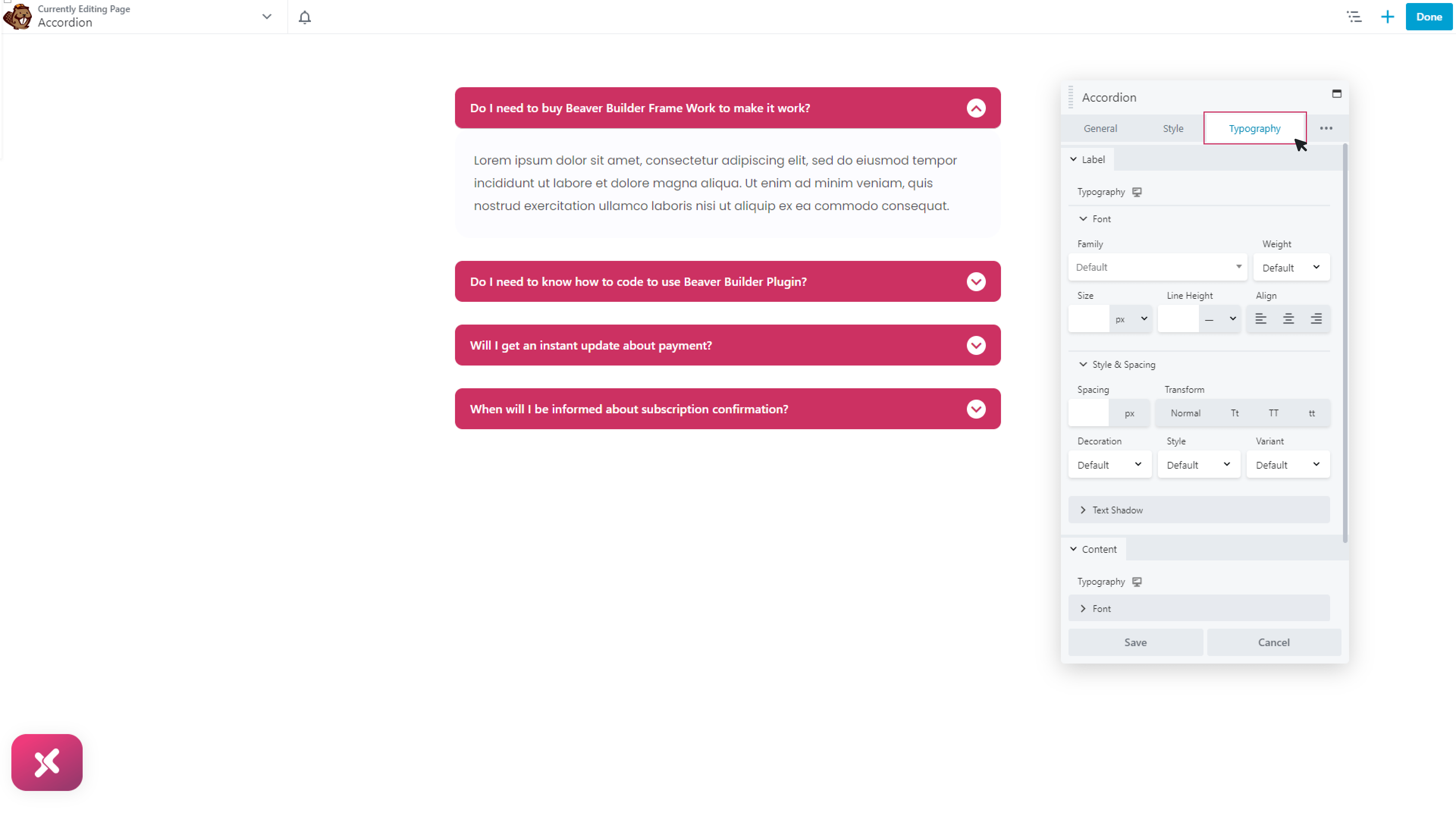
Step 5: Typography
Here set amazing typography for both label and content separately to give an aesthetic appeal.
Choose font style, font size, and text shadow
Conclusion:
You can easily avoid clustering of content in your website by using accordion module for beaver builder. It could make a lot of different in your website appearance. You can easily follow the above guideline to use this module effectively. To learn more on accordion module, you can also check our blog. It is very easy to use. So try our accordion heading module now!
If you like to explore more features to customize your headings, you might check our Drop Cap module, and Dual Color Heading module for beaver builder.
Check our free modules for beaver builder to bring more creativity to your website. You can also explore our 50+ pro modules for beaver builder that will take your website to the next level.
Feel free to ask questions in the comment section below, if you have any other questions related to the dual accordion module for beaver builder.